In case you haven’t noticed, but Salesforce Admins are special. As a Salesforce Admin you have to be special because you are the first one called on if there is a problem. Let’s take a simple problem, but one I run into more often than not- like data being populated in a field and troubleshooting […]
How to make your Salesforce Page Layouts awesome
For as much as I would like to think I’m a web designer- I am not. I think web design is fascinating especially if you look at web pages from just a few years ago to now- so much has changed. But Salesforce Admins- to some degree- have to be web designers. I mean we are dealing with Salesforce Page Layouts on many many objects, not to mention a variety of use cases and user abilities. Now, I would love to tell the magic bullet for making all of your Salesforce Page Layouts phenomenal- but I don’t think one exists. But I can do is give you some best practices that worked for me.
Understanding the ‘F’ design
If you Google website F design you will come across a ton of pages. I like this one the best, I think it most accurately describes the F design. Basically, the F design is the pattern to which people scan, read, and digest web pages. Now, the good news is that by design Salesforce already has an F format. Check it out-

So what does this mean for Admins?
When looking at how you design a Page Layout remember that the upper left-hand corner is your most valuable piece of real estate. So naturally you want the two or three most important fields there- like Account owner, Name, etc. From there you users will move to the right hand column, so while it’s not beach front property don’t discount it. Finally your users will move down the record on the left side so that is where you will want to bulk up on your fields.
What about related lists?
As a user scrolls down the page the F design becomes more important. The left two columns of your related list are gold, anything else to the right might as well be an Elvis impersonator- because it’s not getting their attention. Keep this in mind when users want a hundred different columns in those related list.
Using Free Heat Maps
Companies spend big money on heat maps for their site to ensure they are maximizing usability. Last time I checked Admins don’t have big money to spend on heat maps. But what I did find with a simple Google search is a post with some free heat map tools. I think these are definitely worth trying out if you think it will give you some insight into how your users view a Salesforce page.
An even cheaper alternative
What I have found useful in the past is to create a couple different page layouts in a Sandbox for the users that we are rolling out Salesforce to. Then I schedule a meeting and either using an online meeting tool or in person give them the choices of two different designs, being sure to gather feedback about what they like or don’t like. This user experience testing is also critical to adoption down the road as they will feel more involved with the creation of the tool, and thus have a deeper sense of ownership.
Speed of entry
When I first started as an Admin Brandy Colmer gave me a useful trick that utilized at her company to speed up data entry. Let me explain, for people who have done data entry and can do it at lightening speed they are used to fields being left delineated, so the next field down is the next data entry point. No bouncing around from left to right, etc. Now for data entry this is great, but for readability it’s not so wonderful as it can lead to a super-long page layout. So here is how we get around that.
- Create a Record Type called “Data Entry” and make it the default record type for everyone who does data entry.
- Create a Page Layout for this Record Type that is 1 two-column section with all the fields on the left-hand side.
- Create a Workflow Rule that changes the Record Type to whatever they are using today.
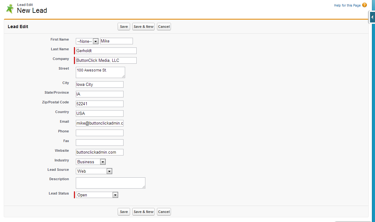
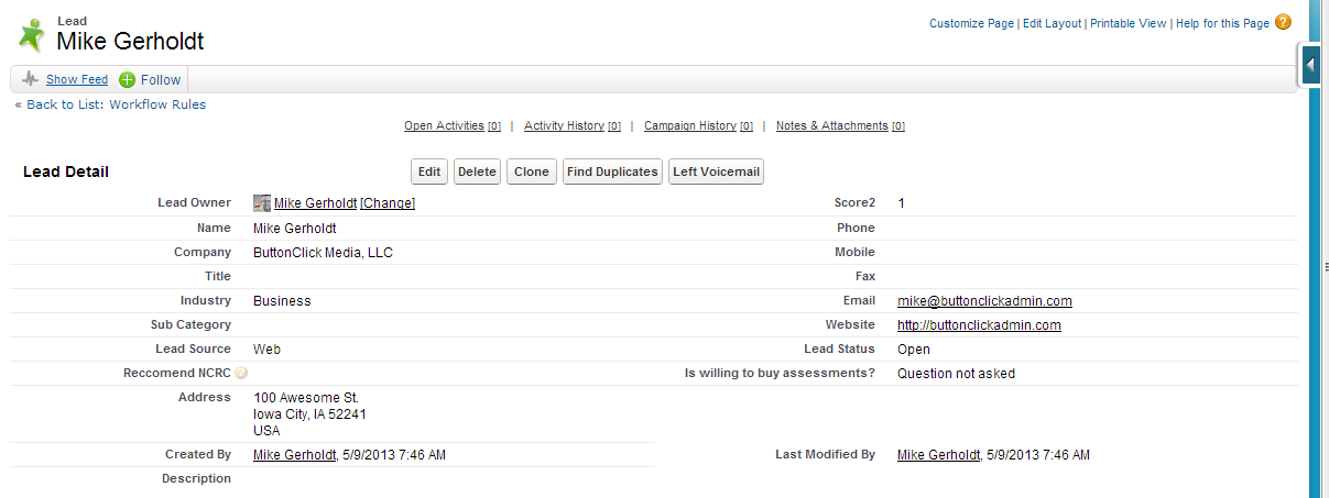
Below are two screenshots to help tell the story better.
Lead Entry Page-
Lead Page after clicking Save (and the workflow fired)-
Use Blank Spaces
A final key to the readability of records is to ensure balance. It sounds funny I bring this up right after talking about left-justifying fields, but having a nice, balanced section really helps the user. My goal with each section is to try to keep it as balanced as possible- 2 fields on the left, 2 fields on the right. Sometimes, it’s just not possible – when that’s the case I utilize Blank Spaces on the Page Layout. Blank spaces not only give the user visual space but help balance each section.
So given what we now know about page layouts- is there anything you would do differently?
Image Credit: webdesign.tutsplus.comRelated Posts

Editor’s note: This is a popular blog post, so we’ve updated it with the latest information and resources on September 8, 2020. In my experience, the email or phone call starts out something like this: “I clicked on this [insert link, account, etc. here] and I’m getting an ‘Insufficient Privileges’ error… I know I should […]
Have you ever needed to implement something in Salesforce that didn’t have a button click solution? I recently helped out some of our #AwesomeAdmins at Salesforce so that a Chatter feature I worked on could be enabled internally. If it helped out admins at Salesforce, maybe it’ll help you too. So let’s walk through it! […]
Trailhead
Learn in-demand skills that lead to top jobs with Trailhead,
the free online learning platform from Salesforce.
the free online learning platform from Salesforce.
Trailblazer Community
Connect, learn, have fun and give back with #AwesomeAdmins across the globe.