How to Configure Salesforce for your Blind and Low Vision Users

By

Accessibility is important to us here at Salesforce, and our team is dedicated to building the platform so that it is accessible to everyone regardless of their abilities. That means we are often asked what Admins can do to configure more accessible Salesforce apps. One of the most common requests is how to optimize apps for blind or low-vision users. While this may be a small percentage of your user base, as an #AwesomeAdmin the positive outcomes of optimizing for these users is indeed very large. These suggestions may also increase productivity for all your users, regardless of their ability level!

While the answer to “how do I optimize apps for blind or low-vision users” will likely vary from scenario to scenario, this post will give you the tools you need to provide the best possible experience for any users in your organization with these disabilities. Since Lightning Experience provides many accessibility features out of the box, our focus here will be on usability, consistency, and efficiency for users who are blind or have low vision.

Identifying Groups of Users Within Groups of Users

One way we can deliver an amazing experience for all of our users is customizing page layouts depending on how users perform work. This is even more important for users with disabilities.

Users who are blind use an assistive technology tool called a screen reader to interact with Salesforce. Screen readers turn text on a page into synthesized speech. They can also describe interactive objects on a page such as form fields, tabsets, menus, and comboboxes. Screen reader users may use special keystrokes to navigate the page by headings by form fields, or even from button to button. Given this, any inefficiencies of a page layout or Lightning record page for one user may be experienced 10 times over by a user who is blind.

Disabilities and assistive technologies aside, consider the Opportunity object. If one group of users frequently needs the Activity Publisher and Timeline, that feature can be prioritized higher on a page.

An opportunity page where the activity timeline is the majority of the page while the details panel, chatter feed, and related lists are in a set of tabs.

If another group of users interacts with the Details section the most on Leads, then those users would benefit from higher prominence of the Detail section on their page.

The clone profile page, where the user is cloning 'Standard User' and the new profile is called 'Screen Reader - Detail Focus'

As not all blind or low vision users in your organization will be performing the same work, it is important to understand how people with these disabilities will be using Salesforce. Talk to your users with disabilities. Gain an understanding for how they work so you can configure Salesforce to be efficient given their workflow and disability.

Creating Profiles

Since we need to make layouts that are optimized for how your users work, the first step is to make new profiles specific to these users.

After speaking with your users, let’s say you identified 2 groups of screenreader users who can benefit from specialized Layouts. The first group’s main activities include logging activities. The second group primarily creates and updates records.

To support these users, we are going to create 2 new profiles.

  1. Go to Profiles in the setup tree and click the ‘New Profile’ button.
  2. Choose which existing profile to clone and name the new profile appropriately. In this example, “Screen Reader – Detail Focus”, as we will promote record detail on their layouts.  

A user edit page, where the Profile dropdown value is 'Screen Reader - detail focus' and it is focused.

3. Keep all the permissions and securities the same, since all that is changing are the layouts.

4. Go to Users in the setup tree and switch the screen reader users’ profiles to the newly created user profile, “Screen Reader – Detail Focus”.

A user edit page, where the Profile dropdown value is 'Screen Reader - detail focus' and it is focused.

Repeat the previous steps to create the ‘Screen Reader – Activity Focus’ profile and assign any applicable users. Now you are ready to create their specific, efficient page layouts!

Changes to the Page Layouts

There are two places we can help make record pages more efficient for our blind and low vision users: Object Page Layouts and Lightning Record Pages.

First, let’s update the object page layouts. We’ll use Opportunities as an example.

  1. Go to Page Layouts for the Opportunity object under the Object Manager.
  2. Create a new page layout and select an Existing Page Layout to clone. Name your new layout as is appropriate, in our example, “Opportunity Screen Reader Efficient Layout”.

The create new page layout page, where the user is cloning 'opportunity layout' and the new layout is named 'Opportunity Screen Reader Efficient Layout'.

3. In the Page Layout Editor (PLE), under Opportunity Detail, make the header for the top section display on the detail page. To do this, click on the wrench icon for this section in the PLE.

The page layout editor for opportunity detail with the wrench icon for the first section focused.

Then make sure the Detail Page and Edit Page checkboxes are checked. Repeat this for all sections in the page layout.

The section properties modal from the page layout editor with 'Display Section Header On' checked for both Detail Page and Edit Page.

This will ultimately make navigation of Record Detail sections easier for screen reader users, as it will add additional headings to the page. Navigating a page by headings is a common strategy for screen reader users.

This is the equivalent of adding small bookmarks at the beginning of each chapter in a book. It makes moving around from section to section much more efficient.

4. Remove any sections, fields, and custom actions from a record layout that your users do not need. This will increase efficiency in moving through forms and record pages.

In our example we condensed from 6 sections and 22 fields to 2 sections and 17 fields.

Opportunity Detail Before:

The opportunity detail page layout editor before: where none of the section headers are visible and there are too many fields.

Opportunity Detail After:

The opportunity detail page layout editor after: there are now headers for each section and less fields.

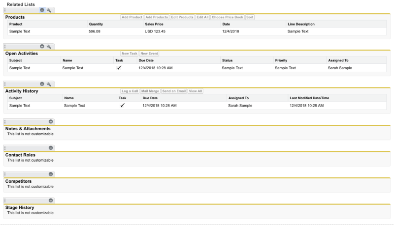
5. Remove any unnecessary related lists from the page layout as well. This can be done by clicking on the delete icons above each related list.

The related lists in the opportunity page layout editor, where the delete icon for the first list is focused.

6. Now, under Page Layout Assignment, assign the new, more efficient page layout to the appropriate user profile.

The page layout assignments for opportunities, the user has assigned 'Screen Reader - Detail Focus' profile to 'Opportunity Screen Reader Efficient Layout' and the save button is focused.

By removing excess clutter from the page, it makes it much quicker for a screen reader or low vision user to get to the information and features that they actually need.

Modify other objects that your users interact with regularly following the same basic guidelines:

  • Display section headers on the detail page
  • Remove unnecessary sections, fields, actions, related lists

Changes to Lightning Record Pages

For Lightning Record Pages, the improvements depend on if the users are blind or low vision.

Blind Users

The biggest advice for blind users is to not use Tabs or Accordions in page layouts in the Lightning App Builder. Instead of placing different components in adjacent tabs, just stack them on top of each other. As we discussed earlier, screen reader users often navigate using headings. When components are placed in Tabs, their contents and headings are hidden from the screen reader. This makes it so a user has to find the set of Tabs, then find and open the correct tab, and then look at the component they want, which adds unnecessary steps to their workflow.

Here’s an example of an Opportunity page that is optimized for mouse users. Using tabs on the left and related lists on the right, everything can fit on the screen at the same time without the need to scroll. However, when a screen reader tries to navigate by header, none of the headers for Activity and Chatter are available in the list of headers. Instead, there is a hidden ‘Tabs’ header that alerts the user to the existence of tabset, and the user is supposed to know that they have to navigate to that header, navigate to the set of tabs, and activate a new tab to reveal more content.

An opportunity page that is not optimized for screen readers with the VoiceOver headings menu visible above it. The headings from the activity timeline and chatter are not in the menu because they are hidden in tabs that aren't currently open.

Here is a layout that is optimized for screen reader users. In this case not everything fits on the screen at the same time, as our users will be navigating by heading.

A view of the full Lightning Opportunity Page layout for screen reader users with all of the components out of tabs.

Now when a user tries to navigate by header, even though a mouse user would need to scroll to see all of the content, a screen reader user can access all of the headers on the page. This allows for quicker navigation.

An opportunity page that is optimized for screen readers with the VoiceOver headings menu visible above it. All of the headings from all of the components are in the menu because none of the components are in tabs.

To do all this this, make new a Lightning Record Page.

  1. Navigate to Lightning App Builder and create or clone the Record Pages that are relevant to your users.
  2. Remove any tabsets and drag the components to the main body of the page canvas. By default, there may be two tabsets on an Opportunity Record Page: a set with Related, Details, and News and another with Activity and Chatter.

The screen reader optimized opportunity page layout in Lightning App Builder.

3. Save the Lightning Record Page and then activate it. In the activation modal, click ‘Assign to Apps, Record Types, and Profiles’.

The activation modal in Lightning App Builder on the 'App, Record Type, and Profiles' step. The 'Assign to Apps, Record Types, and Profiles' button is visible.

4. In the activation modal, assign the page to the appropriate Apps, Record Types, and Profiles and save.

The activation modal in Lightning App Builder on the 'Review Assignments' step. The page is assigned to the Sales App for Master type Records for the 'Screen Reader - Detail Focus' Profile.

5. To check that it has been assigned correctly, or to change the assignment, go to the object’s Lightning Record Pages in the Object Manager.

Review Record Page Assignments for the Opportunity object where the user is going to find the page assigned to the 'Screen Reader - Detail Focus' profile for the Sales app.

Repeat these steps for any other Object Record Pages the users interact with regularly.

Low Vision Users

Unlike screen reader users, the biggest advice for low vision users is to put all of the content in one accordion in one column of the page. Also, add an extra accordion section at the top that defaults to open, so that none of the components are initially visible. Low vision users frequently use tools to zoom in their screen up to 800%, so reducing the clutter on the page and toggling the display of sections of content helps them navigate more quickly.

Here’s the same Opportunity page example optimized for mouse users, but zoomed to 200%. The majority of the content is offscreen and without already knowing where all of the sections are, it might be difficult to know where to look.

An opportunity page that is not optimized for low vision users zoomed in 200%. Only parts of components are visible and it is unclear if there are more components beyond the window.

Here is a layout optimized for low vision users. In this case, all of the sections of content are hidden in accordion sections that can be seen at 200% zoom.

An opportunity page that is optimized for low vision users zoomed in 200%. All of the components are in an accordion and all of the accordion sections are visible so users know which components are on the page.

To help low vision users, repeat the same steps in Lightning App Builder as for screen reader users, except use the Accordion component in the Lightning App Builder and drag the components inside the various sections.

For both blind and low vision users, it is helpful to make the layout of the components across objects consistent. This includes tab and accordion orders (if applicable). This way, the users know how to interact with and find information efficiently across objects they interact with regularly.

We hope you found this article useful and take this as an opportunity to find out more about, and create a better experience for, your users with disabilities. Consider this post as a starting point for how you can create a more accessible, efficient experience for them. Every user with a disability is going to have their own approach or set of techniques for accessing computers and tools like Salesforce. If you aren’t sure what approach will work best for someone, just ask them. They’ll be glad you did!

If you have any questions, comments, or would like you share your experiences regarding Salesforce and accessibility, please contact us on the Disability Topics Trailblazer Community Group.

Helpful Resources

Find us on Twitter: @jessehausler, @shleewhite

About the Authors:

Lee White is an Accessibility Engineer at Salesforce. They focus on the Admin Experience.
Jesse Hausler is the Principal Accessibility Specialist at Salesforce, where he educates people about Universal Design as a way to achieve access for all users.

How to Build Accessible Apps with Adam Rodenbeck

Today on the Salesforce Admins Podcast we’re talking to Adam Rodenbeck, Senior User Experience Team Member at Salesforce, to wrap up our two-part series focused on building accessible apps. We look at his experience developing accessible apps from both the admin and the developer side of things and do a demo live on the pod […]

READ MORE

What is an Accessible App? with Sunday Parker

Today on the Salesforce Admins Podcast we’ve got Sunday Parker, Accessibility Evangelist at Salesforce, to kick off a two-part series focused on building accessible apps. What is it like to use Salesforce if you can’t see what’s on the screen? What if you can’t use a mouse or keyboard? We look at what you can […]

READ MORE
Rainbow ombre Salesforce cloud on the left with the text "Get Started with the Salesforce Anywhere App" on the right

How to Get Started With the Salesforce Anywhere App

Your Salesforce users use many different apps to communicate, collaborate, manage their data and processes in addition to Salesforce. Because of this, it can be difficult for them to optimize their collaboration and productivity while having to flip between various systems. That is why we have combined the power of Salesforce with real-time alerts, chat, […]

READ MORE