It’s 2019, and businesses must move lightning-fast in order to sell, market, and service their customers. #AwesomeAdmins know first-hand that tools like Lightning Report Builder have made this incredible pace much easier to keep up with. These tools enable you to analyze your business in new ways without adding extra clicks, allowing you to be a productivity champion! And now, we welcome the New Report Run Page whose design vision is to expose common actions such as filtering, grouping or sorting when viewing the report itself, rather than when editing or creating reports on the Lightning Report Builder. This tool is available to all Salesforce Users as part of the Spring ’19 release, so you can start using the New Report Run Page today! Check out the top benefits of this new run page below.
Personalized View
Derive insights by personalizing your important reports
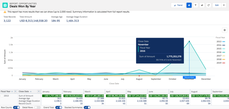
Track your key report metrics: The summary header now shows up to 8 metrics so that you can track important information such as average opportunity amount or CSAT right when you initially run the report.
Understand what’s good or bad with your data with Conditional Formatting: You can now setup up to five rules on any summary metric.
Personalize how you want to view report details table with resizable report columns.
Get a compact view of your matrix reports with stacked summaries toggle: Stack your summaries when you need to analyze a large amount of data with many summaries without much horizontal scrolling.
Customize the report chart: Select a chart type and axis that makes the most sense for your analysis and add this chart to your favorite Lightning dashboard right on the run page actions.
Modify filters: Edit existing filters on your report to customize your view further.
Interactive Drill Downs
Drill down on your data in new ways to answer specific business questions
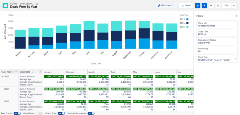
In the report example shown above, as a business user, I may want to drill down on why some years or months bring in more business than others. There’s multiple ways now on how I can drill down on a Lightning report:
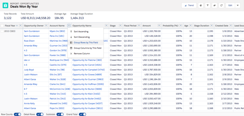
Drill Down on Grouping: When you are viewing a large report, toggle the details rows off and drill down on just the data you are looking for. Once you identified the specific data, you can toggle details rows on for that outermost row grouping.
Drill Down on Summary Table: For matrix reports (the reports where you have at least 1 row grouping and 1 column grouping), you can interact with the summary table to get only the detail rows for a specific summary.
Drill Down on Report Chart: Clicking into a chart segment to filter details only for that segment.
Drill down from a Lightning Dashboard: This automatically adds a linked filter to the report run page so that you can easily continue your analysis.
Dynamic Groupings
Quickly change the report format to explore your data in another way
Business users may want to analyze the same data in different ways to comprehend what’s going on with their business. They can get even more out of the reports you’ve built without the need to edit them. They can do that by:
Grouping any field by rows or columns right on the run page column actions without having to edit the report. The report chart is automatically updated when your groupings are edited.
Sorting a grouping by name or by any summary metric on the report using “Sort by” column action.
Do you have feedback to share on this new run page? Let me know your thoughts by reaching out via email (asurepeddi@salesforce.com), Twitter (@anushasurepeddi), or on the Trailblazer Community.