Einstein Prediction Builder: How Do I Know if My Prediction Is Working?

By

So you’ve created a new prediction, have it set up just the way you want, and enabled it so that you can start receiving predictions on new data as it comes in. You have already checked out the scorecard (see more information in this blog post) at the time you set up your prediction, so you have an idea of how it is expected to perform. But how good are your predictions going to be, really? Are they going to be accurate enough? Will they give you enough insight to allow you to take the right actions?

The good news is that, as a Salesforce Admin, you have access to the tools you need to get an answer to these questions. Let’s check out some ways we can go about this, starting with an example.

Predicting late invoices example

In this example scenario, we would like to predict which sales invoices are likely to be paid late so we can either take steps to prevent it or to prepare for the impact. We have set up a prediction using the Invoices object. We are predicting when the Invoice Status is equal to Late and we are storing the prediction scores in a field called ProbLateB.

We created this prediction a little while ago and it has been running and delivering predictions for several weeks. Let’s take a look at some ways we can measure how good these scores actually are.

Scores in the Table View

The most basic way we can assess our new predictions is to just look at a few of them and see if they make sense. We can do that using the Table View. Follow these steps:

  1. Go to the Table View for the Invoices object.
  2. Display a few important fields for invoices (Invoice Amount, Payment Method, Service).
  3. Display the field we are trying to predict (Invoice Status).
  4. Display the prediction scores field (ProbLateB).
  5. Sort by ProbLateB.

When all of that has been set up, we get the table view below.

There are a few things we can observe here.

  • The maximum prediction here is a 31% chance of late payment. This sounds reasonable to me since about 10% of all invoices tend to be paid late and I expect that some would have an overall higher chance than that.
  • Out of the 10 invoices here predicted most likely to be paid late, 9 of them actually were paid late (Invoice Status). On top of that, the remaining one is in a Pending status and may still end up paid late after all (Maybe we should send out a due date reminder!).
  • If we were to scroll down the list, we see fewer late payments and more on-time payments with lower prediction scores.

At first glance, things are looking good; the invoices that got higher scores did end up being paid late and those with the lower scores were paid on time. Doing well so far, but this is just a glimpse – and maybe we would like to find a way to look at the full picture.

Summarize in a report

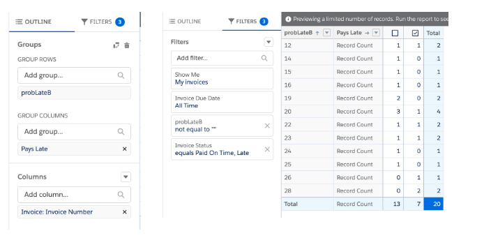
One way to get a better overall view of the prediction quality is to summarize the predictions using a report. What we would like to see in this case is a table of the scores that were given along with whether or not the invoice was paid on time. This can be done in a few quick steps in the report wizard.

  1. Create a new report on the object you are interested in.
  2. Add some filters.
  3. Show only invoices that were given a score: probLateB not equal to “”.
  4. Show only invoices that have closed: Invoice Status equals Paid On Time or Late.
  5. Group Rows by prediction score, probLateB.
  6. Group Columns by the checkbox field we are predicting, Pays Late.
  7. Keep the default aggregation, Record Count, to get a total count of invoices paid on-time and late for each score.

After all of that, we end up with a table like the one below.

Now we have a much more thorough summary of the predictions we have been getting. We can really begin to tell if invoices that got a higher score actually are paid late or not, and we can start to get a feel for how high the score needs to be before we start worrying about getting a late payment.

A report with a bunch of numbers is great for delivering all the information, but let’s take the next step and make things a bit easier to see and interpret.

Create a dashboard

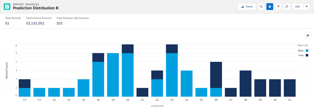
Once we have a report created, it’s just one more step to turn it into a nice visualization and put it into a dashboard so we can continue to monitor it. So let’s visualize this report in bar-chart form by doing the following:

  1. Create new visualization by clicking Add Chart.
  2. Click the gear icon to edit Chart Properties.
  3. Select Stacked Column type chart.
  4. Save & Run your report with chart.
  5. If desired, you can add your visualization to a dashboard by clicking the arrow next to Edit in the report view and selecting Add to Dashboard.

This should give us something that looks like what we have below.

Here, we can much more easily tell at a glance how our predictions are doing and get some insights. I can see that the scores range from 12 to 31 but most are in the middle of that range. I also see that scores above 26 or 27 almost always pay late and most scores below 20 pay on time. I can also see some cases where the predictions are not what we would expect; for example, an invoice was paid late that got a score of only 12 percent. It gives us some indication that not all the scores are perfect. Hey, predicting the future can be tough sometimes.

Put some numbers to it

So far, we have looked at some ways to get a qualitative view of our predictions; that is, we can say they look “pretty good.” But what if we want to get a more quantitative measure and get some hard numbers that tell us the performance of our predictions? The good news is that there’s a huge number of options for statistical measures for assessing scores on a yes-or-no prediction like this. For this example, we’ll calculate the Accuracy of the predictions because it is easiest to interpret, but there are other measures you could use such as Precision, Recall, F1-Score, or Area-Under-Curve (which is estimated in your scorecard), depending on what’s most important in your situation.

In order to measure Accuracy, we need to pick a cutoff score, above which we will classify an invoice as “Late” and below we will classify as “On Time”. For this problem, I will choose a score of 26 based on the dashboard that was created previously. To calculate the accuracy, let’s first create a formula field to tell us if a prediction is correct or not. A prediction is considered “correct” in 2 cases:

  • The score is 26 or greater and the invoice was paid late.
  • The score is below 26 and the invoice was paid on time.

We can then create a formula field called probLateBIsCorrect with the following formula:

IF(

 OR(

   AND(probLateB__c >= 26, Pays_Late__c),

   AND(probLateB__c < 26, NOT(Pays_Late__c))

), 1, 0)

Finally, we can create another report to summarize these results.

  1. Create another new report on the object.
  2. Add the same filters as before:
  3. Show only invoices that were given a score: probLateB not equal to “”.
  4. Show only invoices that have closed: Invoice Status equals Paid On Time or Late.
  5. Group Rows by the field we are predicting, Pays Late.
  6. Select Column, probLateBIsCorrect, to display and then click the column name to summarize by Average and not Sum.
  7. You may want to uncheck Detail Rows to remove extra information.

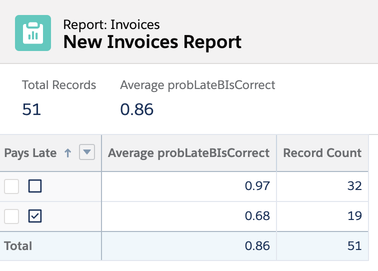
This should yield the following result:

The “Average” we are displaying is the average number of times our prediction was correct. So it looks like our model is correct 86% of the time (when the score cutoff is at 26). We can add this report to our dashboard along with the score visualization and continue to monitor performance over time as more Invoices come in.

With these tools in place, we should have a much better picture of how good our predictions are and a better idea of what to expect from them going forward.


How Salesforce Einstein Is Supercharging Mobile Experiences.

How Salesforce Einstein Is Supercharging Mobile Experiences

While its impact is widespread, one of the most exciting aspects of artificial intelligence (AI) is its ability to create conversational interactions that generate personalized experiences, supercharging productivity and efficiency. In this blog post, we’ll explore how the implementation of large language models on mobile devices is reshaping the enterprise mobile landscape and how Salesforce […]

READ MORE
Einstein standing next to text that says, "How to Use Generative AI Tools to Write SOQL Queries."

How to Use Generative AI Tools to Write SOQL Queries

Salesforce Object Query Language (SOQL) is a powerful tool that allows you to retrieve data from Salesforce. You can use SOQL to query any Salesforce object, including custom objects, custom fields, and user permissions like profile and permission set perms. As a Salesforce Admin, I know that writing SOQL queries can be a pain. Not […]

READ MORE
Headshot of Tom Hoffman next to text that says, "AI Prompt Writing for Salesforce Professionals."

AI Prompt Writing for Salesforce Professionals

The rise of the machines Machines and artificial intelligence (AI) have been part of popular discussion since Samuel Butler authored Erewhon (1872), where his satirical utopian society explored the morality of conscious machines as a natural evolution of the Industrial Revolution. One-hundred and fifty years later, OpenAI released GPT-4, introducing the world to AI that […]

READ MORE