So, you’ve built a prediction with Einstein Prediction Builder ?. You’ve even researched how to think through those predictions while keeping bias in mind in order to get the most accurate set of predictions moving forward. And now, you’re ready to take a deeper look at your scorecard metrics and the quality of your prediction. Congratulations, #AwesomeAdmin—you’re building incredible efficiency into your org by utilizing all the valuable components of AI and machine learning! Now, let’s dive into how you can better understand your scorecard metrics.
In this post, we’ll walk through an example scorecard to learn more about your predictions in Einstein Prediction Builder. The scorecard is the go-to place to determine prediction performance and to identify possible modeling issues. In this use case, we’re using example customer data to predict whether or not a customer will pay their bill on time.

In the Overview tab of the scorecard (above), we can see a high-level summary of our prediction. The first thing to notice is the Prediction Quality meter, which gives us an estimate of how well our predictive model will perform on new records once we deploy it. This number is computed based on how accurately we were able to make predictions on a sample of data unseen by the model during training.
Why should you care about prediction quality?
There are two main reasons why prediction quality matters.
The first one is obvious: trust. If you’re basing important business decisions on the predictions of an algorithm—for example, deciding which late invoices you should focus on or where to spend your marketing money—you want to make sure that it produces something that makes sense.
The second one is comparability. Now that you saw how easy it was to create a prediction with Prediction Builder, you may want to iterate and try different things out, such as adding or removing certain fields, creating predictions for different segments, etc. The expected Prediction Quality will help you pick the best version of your prediction configuration (which, combined with your data, produces what we call in machine learning jargon a model). In addition, it will let you monitor performance over time and make sure it doesn’t degrade.
How do I measure quality?
In the world of machine learning, you measure quality by measuring the error the predictive algorithm makes. That is, you want to have a sense of the mistakes the model will make when applied to new data.
As it’s impossible to know in advance the mistakes that will be made, this is typically done on some kind of test dataset. The best test dataset is one that’s as close as possible to what you can expect to predict on in the future. There are different ways to obtain such a test dataset, but the most common is simply to carve out a part of your historical data to test on.
So, you train your algorithm on the bulk of your historical data, and then run it on the part you carved out. Since this is all historical data, the outcome is known, so you can compare the predictions to the actual outcome.
The Prediction Quality number you got was obtained in the way we just described, by assessing the error on a test data set. That is why the Prediction Quality number you get is an expected Prediction Quality. If you mouse over the little Info symbol next to the meter it reads: “Indicates how accurate your prediction is likely to be”. In other words, it is just a prediction on how our model will perform!

To get the actual Prediction Quality, you will need more patience. Only after your model has been deployed, and has started to make predictions on new items (for example, scoring late invoices), will you be able to assess the actual quality. Depending on your business, length of sales cycle, and volume of late invoices, that could take weeks or months. Once you get there, you may want to check out this post that explains how you can set up Reports and Dashboards to assess prediction quality for predictions that have been running for a while.
For now, it’s enough to know that for binary classification predictions, the prediction quality ranges from 50 to 100, and for numeric outcomes (regressions), the prediction quality ranges instead from 0 to 100.
Aside from the difference in scale, the meters have different color ranges, but the overarching idea is the same regardless of your prediction type. For this example, we’ll focus on the binary classification case.
Is it Good Enough?
Now the natural question that comes to mind, assuming the meter is somewhere in the green, is: “Okay, it’s good (or great), but how good is it? And is it good enough?” Whether it’s “good enough” depends a lot on your data and how you intend to use your prediction. Let’s unpack that.
We can see that our current prediction has a score of 92, so we expect it to be very accurate for predicting both new and on-time bills. A score of 50 indicates that a prediction is no better than random guessing, while a score of 100 means our model perfectly predicted all the records in the test dataset. So with a score of 92, we could expect our model to accurately identify most late and on-time bills. However, this number is just an estimate, and we may not actually be able to attain as impressive results in practice.
Your actual prediction performance will depend on a variety of factors, such as how similar the new records are to the training records. When it comes to making predictions, there are no magic numbers, and “good enough” performance depends on the use case at hand. For example, if we’re using our late payment prediction to gain some insight into which factors lead to customers paying late, we’ll have a lower bar for model quality than if we were relying on our predictions to inform major business decisions around our expected revenue. Fortunately, as we’ll soon see, the scorecard can help us gain insight into our models so that we can troubleshoot potential issues and iterate to get an improved model performance. The benefit of having a prediction quality metric is comparability, and you may want to make some edits (such as adding/removing fields or creating segments) and pick the prediction with the highest quality.
A low prediction quality (one in the red or yellow zone on the left side of the meter) is often the result of insufficient or low-quality data (e.g., a lot of missing records or noisy data). On the other end of the spectrum, a prediction quality in the red zone on the high side of the meter is typically “too good to be true,” and we would not expect to be able to replicate such impressive results on new records.
A common cause of such an artificially high model quality score is hindsight bias, which occurs when our model learns information that is available only after the outcome is known. For example, suppose that in our invoice data we track a field entitled “days late on payment”. Before the due date, this field will typically be empty because it is only filled out once payment is received. If we train on our old invoice records, where this field is mostly filled out, our prediction will likely learn that when the field value is 0, the invoice is on-time; but when it’s positive, the invoice will be late. So, on our training data, we’ll get great results. However, we will not be able to replicate this on new invoices, because we will no longer have access to this field. In order to resolve this, we would have to remove this field when first setting up the prediction. In general, hindsight bias can be very difficult to detect automatically.
Digging into the scorecard
What can we do, then, if our model performance is either too low or seems too good to be true? Or, what if we just want to learn more about our prediction before deploying it? For this, we can click on the Predictors tab where we can see a list of some of the fields we used in the prediction. The impact score tells how significant each field is in the predictive model. If you see a low prediction quality field, you may want to use the Data Checker in the setup wizard to make sure you have enough historical records or to see if there’s any additional data you can use or clean up. A field with a suspiciously high impact could indicate a “leaky field” that is polluted by hindsight bias, as described above. Below on the right, we can see a more granular view of the total contribution of a field.

For example, if we click on the field Payment_Method__c, we can see the contribution of each specific payment type to the prediction. In this case, we see that using a credit card is by far most predictive for a late payment of the three types. One thing we should ask ourselves is if we know the payment time before the payment is made. If it’s determined only at the time of payment, then we should consider removing it from our next iteration. We could consult the payment team for specifics on how and when this field is used.
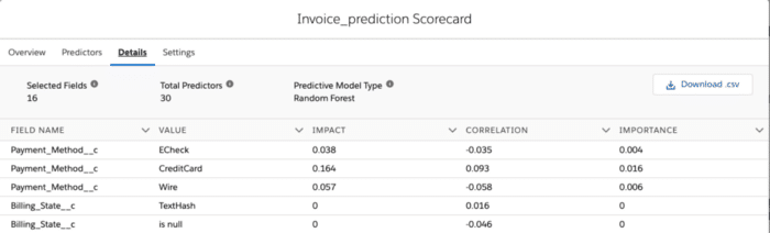
Next, let’s take a closer look at the Details tab to the right of Predictors.

This tab lists the most important fields in our prediction, as determined by correlation with the label and feature importance. For practical reasons, we limit the display to the top 100 features by correlation and the top 100 by impact—so, at most, 200 fields. If you have more than 200 fields in your prediction object, do not be alarmed if you do not see them all in this tab. Under Selected Fields, we can see that our prediction used 16 fields. In general, this number may be less than the number of fields included when building the prediction. Prediction Builder may have decided not to include some fields because they had too many blank values or because they appeared to be leaky fields, or it determined that they were otherwise not useful for making a prediction.
Notice that the second number above, “Total Predictors,” is larger than the selected fields. A predictor, also known as a feature, is a numeric value that Prediction Builder extracts and combines from the various fields in the data to form a usable input for our modeling algorithm. Often, the number is larger than the number of selected fields because Builder creates multiple predictors from each field. For example, from the Payment_Method field three predictors were extracted—one for each of the three payment types: ECheck, CreditCard, and Wire. Each of these predictors is either a 1 or 0 to indicate whether or not this payment type was used.
As another example, for Date fields we extract several predictors—such as the hour of the day, the day of the week, and the day of the month—to look for daily, weekly, and monthly predictive trends, respectively. For example, maybe invoices during the end of the year are more likely to be late, or possibly those sent out at the beginning of the month while people wait for their paychecks.
The Predictive Model type indicates which family of algorithm was selected to make predictions. The two main families currently supported by Prediction Builder are random forests and logistic regression for binary classification, and linear regression and random forests for regression. This model selection is made during model training by trying out several different variants of each model and then choosing the one that performs the best.
The Value column next to Field Name describes the type of predictor that is derived from the field. For example, for a field such as Payment_Method that takes one of several categories in a list, the value will be one of the categories, and the corresponding field indicates whether or not this category is present. For other fields, the value contains the type of field, such as Numeric or TextHash (a numeric value derived from the text field).
Lastly, the Correlation, Importance, and Impact columns are different measures for indicating how important a field is for determining the label. Correlation indicates the strength of the linear trend between the field and the label. A positive value means that the field and label tend to increase together, and a negative value means that one increases as the other decreases. One benefit of correlation is that it is independent of the model used.
Importance, on the other hand, is a measure that’s more useful for telling us how important a predictor is for determining a prediction. However, importance is also model-dependent. The larger the value, the more useful the field is for prediction. The scale of importance depends on the type of algorithm used.
Impact is just a scaled version of importance, so the size no longer depends on the algorithm used. More specifically, we scale it so all features have an impact between 0 and 1, with the most important feature always having an impact of exactly 1. This makes it easier to compare values across predictions trained on different algorithms. Features that have leaked information from the label often have a very high impact because they’re too good to be true. For this reason, it’s a great idea to look at your most important predictors and ask yourself, “Is this info I will know before I have the answer to my prediction?” or “Does this field secretly contain some information about the right answer?”
Other situations that we should look out for include:
- A few fields having very high feature importances while the remainder have very low feature importances
- A situation where all feature importances and correlations are very low
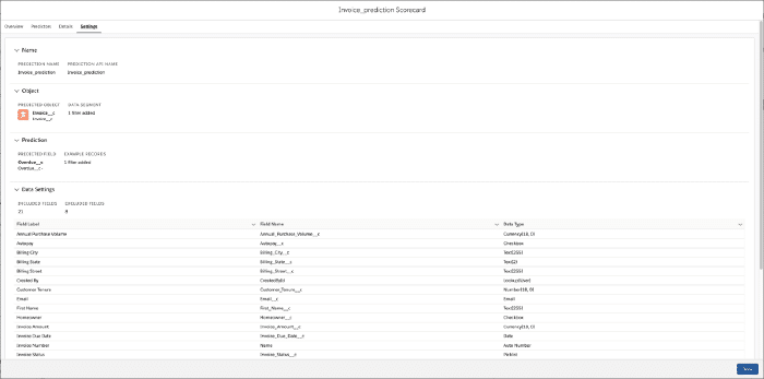
The last tab, Settings, gives a quick overview of the data used to make our predictions, including the predicted field, the prediction object, and the fields used to derive predictors.

In summary, the scorecard is our first stop to learn about the quality we can expect from our predictions. Furthermore, it gives us an overview of the data used in the final prediction and what aspects of the different fields were most useful in making this prediction. Most importantly, we can use the scorecard for sanity checking and to help improve the next iteration of our model.
Resources:
Find more content for Admins on our Einstein page.
A note about the authors:
This post was contributed by both Eric Wayman and Thierry Donneau-Golencer. Their original posts were collated into a single resource for the Salesforce Admins blog.