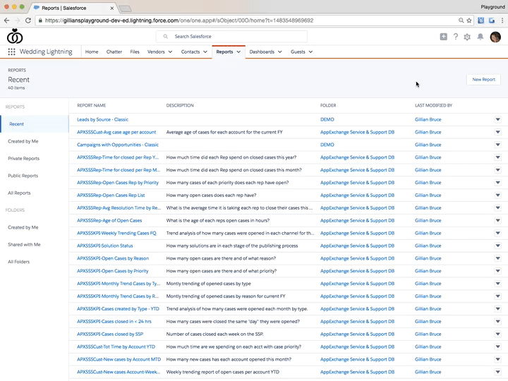
And, we’re back! The Learn Lightning series continues into 2017 as we go through common Admin tasks in the Lightning Experience that we are used to doing in Classic. Before the holiday break, we learned how to navigate setup, create an app, create & clone users, create groups, and create & edit objects. Now let’s tackle reports.
Reports and dashboards in Lightning are more fun – they look better, are easier to customize, and you can add them to any page using the Lightning App Builder. They look way different than they do in Classic, which can be intimidating. But what about building them? Let’s take a look.
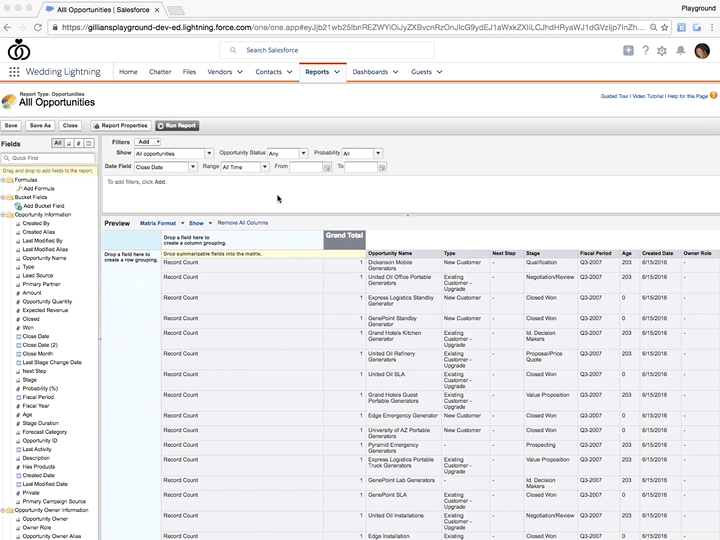
When you create a new report in Lightning, you actually see the Classic report builder. This is familiar territory! You can create reports exactly the same way we are used to doing.
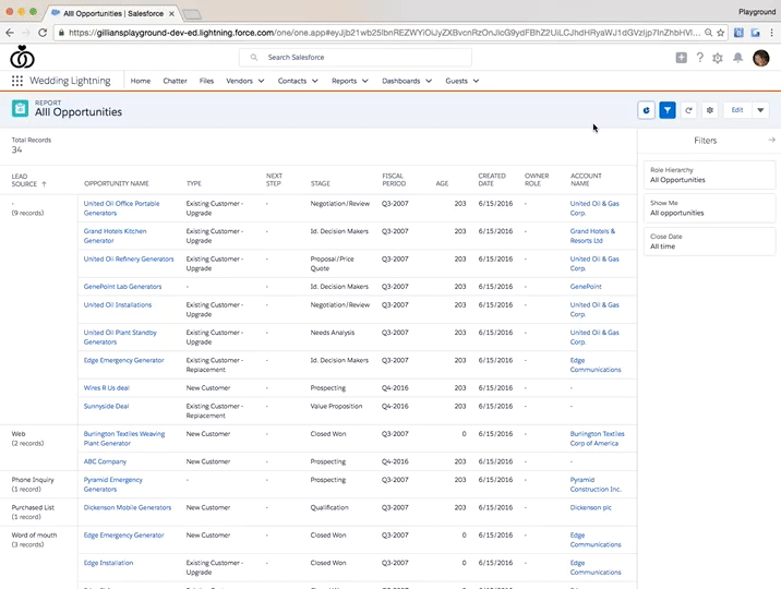
The magic starts after you’ve created the report, and are viewing it in Lightning. The report view is different than in Classic, and now you can play with filters and charts to display your data in the way that you want.
I want to know where my opportunities are coming from. That means I need to create a report that shows my opportunities organized by lead source. To do this, I need to create a matrix report and drag over lead source into the grouping column.
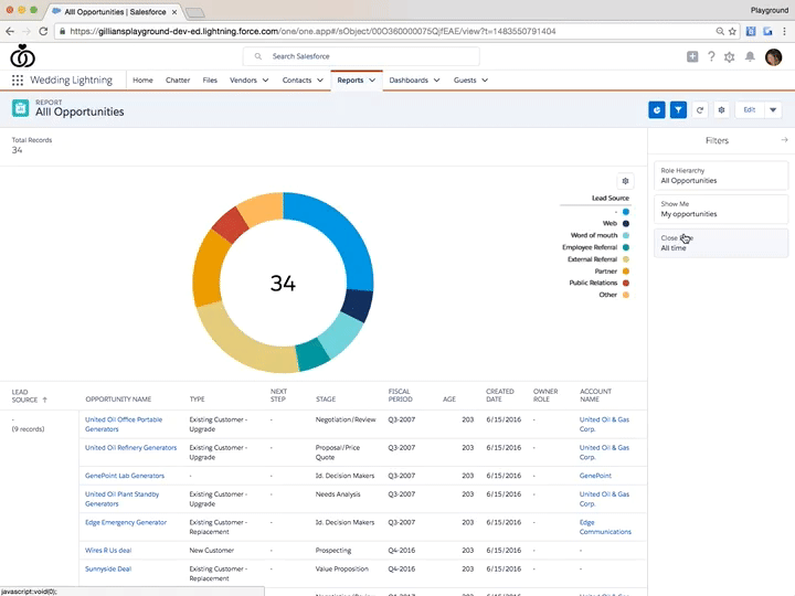
After I save and run the report, I can see it in the Lightning report view. This is where things are different than in Classic. In this view, I can add a chart using the chart icon, and switch the type of chart using the gear icon. For this report, I want to see which lead sources are generating the most opportunities, so I choose a donut chart.
Now I can dig a little deeper and customize my chart. Right now, I see all opportunities, but I can use the filters pane to change that to just my opportunities this year. One of my favorite nerdy things to do in Lightning is to play with filters and see the chart change – pretty fun, right? Ok, perhaps that’s just me…
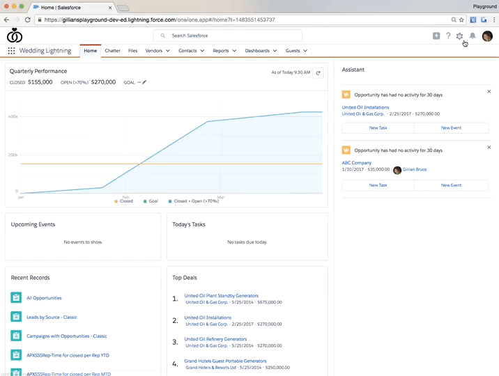
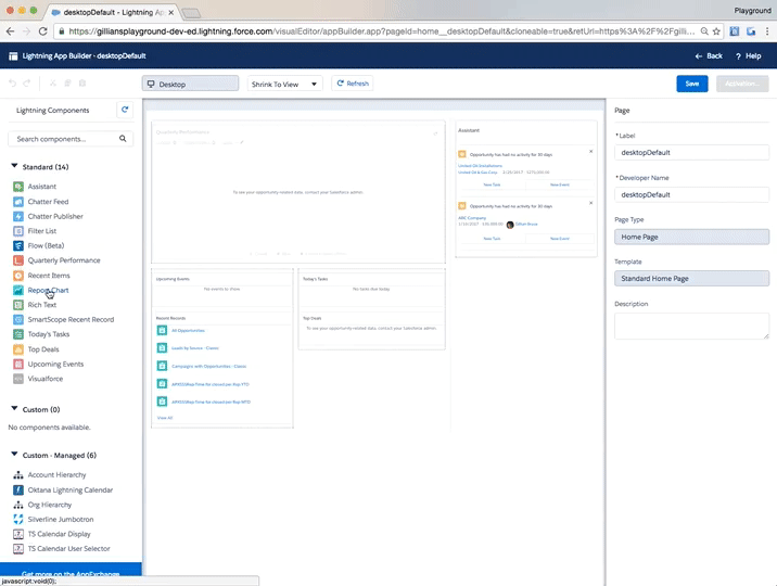
Now that I’ve created my pretty report, I want to add it to my homepage so I can see it every time I login to Salesforce. To do this, I can simply go to my home page, and use the gear icon to select Edit Page which will take me to the Lightning App Builder.
Using the standard components on the left, I drag over the Report Chart component to my home page and select my report chart from the drop down. Note: The report must not be in your Personal Reports folder in order to add them to any page using Lightning App Builder.
Not only can I add my report chart to my home page, but I can add report charts to record pages and app pages. This makes it much easier for me to share data with my users so they aren’t bugging me for updated reports all the time.
All your reports you’ve created in Classic are available in Lightning, so you don’t have to create all new ones as you prepare to switch. Take some time and play with your reports in Lightning by adding charts, adjusting filters, and see what combinations make it easiest for you to view and share your data. If you’re like me, you might get caught spending a little too much time enjoying how the report charts change with different filters. Let out that inner data nerd!
What report charts are you creating in Lightning? What pages are you adding them to in your app? I want to know! Share screenshots with me @gilliankbruce.
Check out the rest of the Learn Lightning series:
Part 1: Setup
Part 2: Create an App
Part 3: Create & Clone Users
Part 4: Create Groups
Part 5: Create & Edit Objects