After years of staring at bright screens, managing eye fatigue, and cleaning your blue-light glasses, we’re thrilled to finally launch dark mode (beta) to Starter orgs in Winter ’26. We know you’ve been asking for this feature for years, so we needed to do it right and ensure the experience would be stable across our product suite. As Salesforce Admins, you play a key role in preparing your org for dark mode.
Users that flip the switch to dark mode can benefit from reduced eye strain, decreased light sensitivity, and enhanced readability for users with low vision. This feature is not just a cosmetic update; it’s a thoughtful response to user feedback and a step toward a more inclusive and accessible platform. By implementing dark mode, we’re reaffirming our commitment to building interfaces that are both reliable and user-centric.
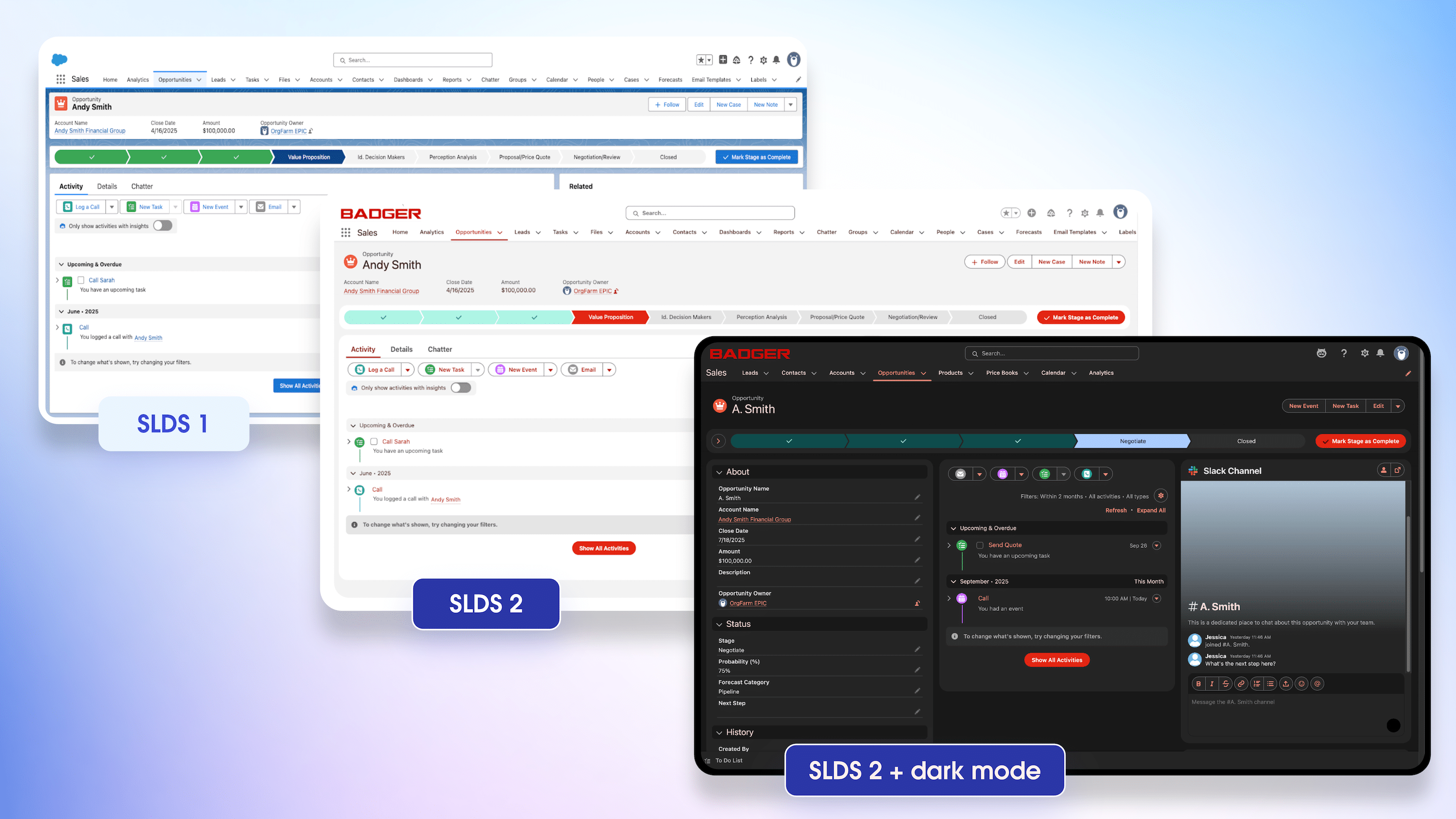
Dark mode (beta) for Salesforce Lightning Design System (SLDS) 2 will first be available to Starter orgs in Winter ’26, followed by a gradual rollout to Sales and Service Clouds in the next few releases.
Part of a broader initiative to modernize our user interfaces (UIs), dark mode is built on SLDS 2, the latest design system for the Lightning platform and the first major UI update in a decade. To use dark mode, orgs must first adopt SLDS 2, which is now generally available (GA) in Winter ’26.
Let’s talk about the steps you can take to prepare your org for dark mode and make your transition to SLDS 2 seamless.
Here’s what we’ll cover.
- Familiarize yourself with SLDS 2, the foundation for dark mode.
- Understand your org’s technical readiness.
- Gain buy-in from your business.
- Prepare your users for change.
Familiarize yourself with SLDS 2
SLDS 2 is a game-changer for admins, developers, designers, and end users. It decouples the component structure from the visual style, allowing for deeper customization and theming capabilities. SLDS 2 leverages CSS variables called styling hooks that transform the UI from static to dynamic, allowing for real-time personalization features like dark mode.
Unlike the move from Classic to Lightning in 2015, this update is at the CSS level—meaning there’s no change to your click paths or functional workflows, only visual styling updates.
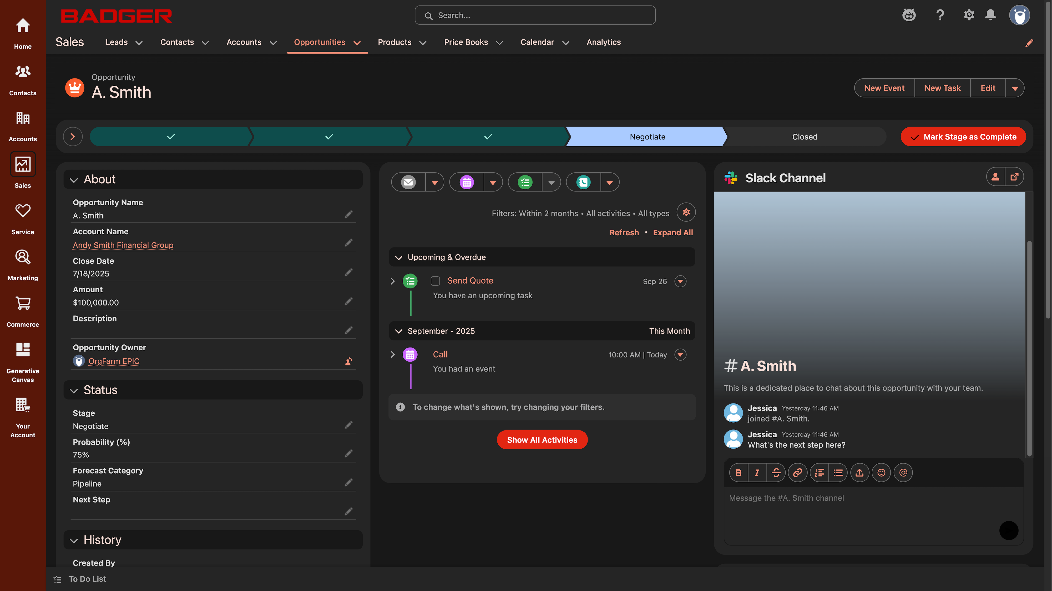
With SLDS 2, enhanced spacing and intentional use of color draws the user’s attention to the important workflow steps, improves navigation, and provides users with a sense of calm. The rounded edges and modern visual style bring a much-needed refresh while remaining familiar enough to easily adopt without education or training.
But it’s not just a visual refresh. By adopting SLDS 2, you’re laying the groundwork for a more flexible future with a foundation that can adapt to new trends and technologies.
Understand your org’s technical readiness
Before you can fully embrace dark mode, it’s essential to assess your org’s technical readiness. Start by previewing the default SLDS 2 theme, Salesforce Cosmos, to ensure that everything looks as expected. You can do this by navigating to Setup > Themes and Branding, selecting the Salesforce Cosmos theme, and clicking Preview. In Preview mode, navigate around your org and pay close attention to the visual styling of your pages.
If your components are using Lightning Web Component (LWC) best practices, there should be no issues. But if you’ve customized your components with hard-coded values for color, padding, spacing, etc., then you may find visual regressions like icon misalignment or incorrect text color.
If issues arise due to customizations, developers can use SLDS Linter to analyze code against SLDS 2 guidelines and pinpoint the gaps. The tool has a bulk-fix feature that automatically resolves certain errors, reducing the need for manual intervention. When fixing custom components, focus on replacing hard-coded color values with styling hooks. If you encounter SLDS 2 compliance issues with managed packages, reach out to the vendor to ensure they update their app to SLDS 2.
For more info about refactoring custom components for dark mode:
- Check out this blog about Data Cloud’s large-scale transition to SLDS 2 and how they refactored thousands of custom components with only a few resources.
- Take the new Trailhead module Dark Mode in SLDS 2: Quick Look.
Get buy-in from your business
Convincing business leaders to invest in a modern UI, including dark mode, is crucial for a successful transition. Your company may have competing priorities or limited resources, so before talking to leadership about this change, it’s a good idea to frame your proposal from the CTO’s perspective by highlighting the business impact and using key metrics.
Here are some business-driven arguments you can use to gain buy-in.
- Enhanced flexibility and future-proofing: Modern UI frameworks like SLDS 2 provide the flexibility needed to keep up with the dynamic and personalized future of experience design. Eighty-one percent of companies can’t keep up with the pace of change (KPMG). This new foundation ensures that your UI can adapt to new trends and technologies without requiring major overhauls.
- Improved user experience (UX) and credibility: A modern UI can significantly boost UX, which is essential for maintaining and growing market share. Research shows that businesses that invest in UX have 41% higher market share (Forrester), and 75% of users judge a company’s credibility by its site design (Medium).
- Technical advancements and efficiency: SLDS 2 is an opportunity to cut down on technical debt, improve the Continuous Integration/Continuous Delivery (CI/CD) process, and start building better code. This can improve development processes and reduce the cost of ongoing system maintenance.
- User preferences and accessibility: Dark mode is a highly requested feature that will delight users. Studies show that 82% of users choose to use dark mode (Medium), making it a quick win for a large volume of users. By providing dark mode, you can cater to user preferences and improve the overall accessibility of your UI.
Prepare your users for change
After years of working with a familiar interface, even minor styling changes can create temporary styling disruptions for users. Change can be challenging, but with the right strategies, you can ensure a smooth transition to SLDS 2 and dark mode. To ensure successful user adoption, it’s important to consider how various users will react to change and take steps to ease users through the transition.
Here are some best practices to help you prepare your users.
- Get key users comfortable with the new UI before launch: Encourage your most critical users to explore SLDS 2 in a sandbox or user acceptance testing (UAT) environment. This gives them a chance to voice concerns, ask questions, and familiarize themselves with the new design.
- Announce the UI change early and send reminders: Send an initial email 3–4 weeks before activating the SLDS 2 theme, followed by reminder emails 1 week and 2–3 days before the launch. Highlight the benefits and mention any support resources. Include a short demo video or before/after screenshots to illustrate the changes.
- Set up a feedback channel for questions and issues: Provide a way for users to report any issues or ask questions. This can help you address concerns promptly and make the necessary adjustments.
- Focus on benefits and address concerns proactively: Clarify that the change is only to visual styling, such as rounded edges, spacing, and color contrast, and that workflows and click paths will remain the same. Emphasize the importance of accessibility and the improved user experience.
- Encourage participation: Offer incentives like prizes for early adopters or provide pizza on the day of the new UI launch. Create a fun and engaging theme name for your new SLDS 2 theme to build excitement.
- Show patience and support: Recognize that everyone adapts to change differently. Provide ongoing assistance or office hours, which can be reduced over time as users become more comfortable with the new design.
By taking these steps to support users during change, they’re more likely to become a champion and supporter of your Salesforce processes.
Preparing for dark mode by activating SLDS 2 is a step toward a more adaptable, accessible, and user-centric platform. By proactively taking these steps, you can ensure a smooth transition and prepare your org for new features your users will love.
Get started with the flexible foundation of SLDS 2 and follow Salesforce Designers on LinkedIn to get the latest news on dark mode and the future of Salesforce experiences.
Resources

