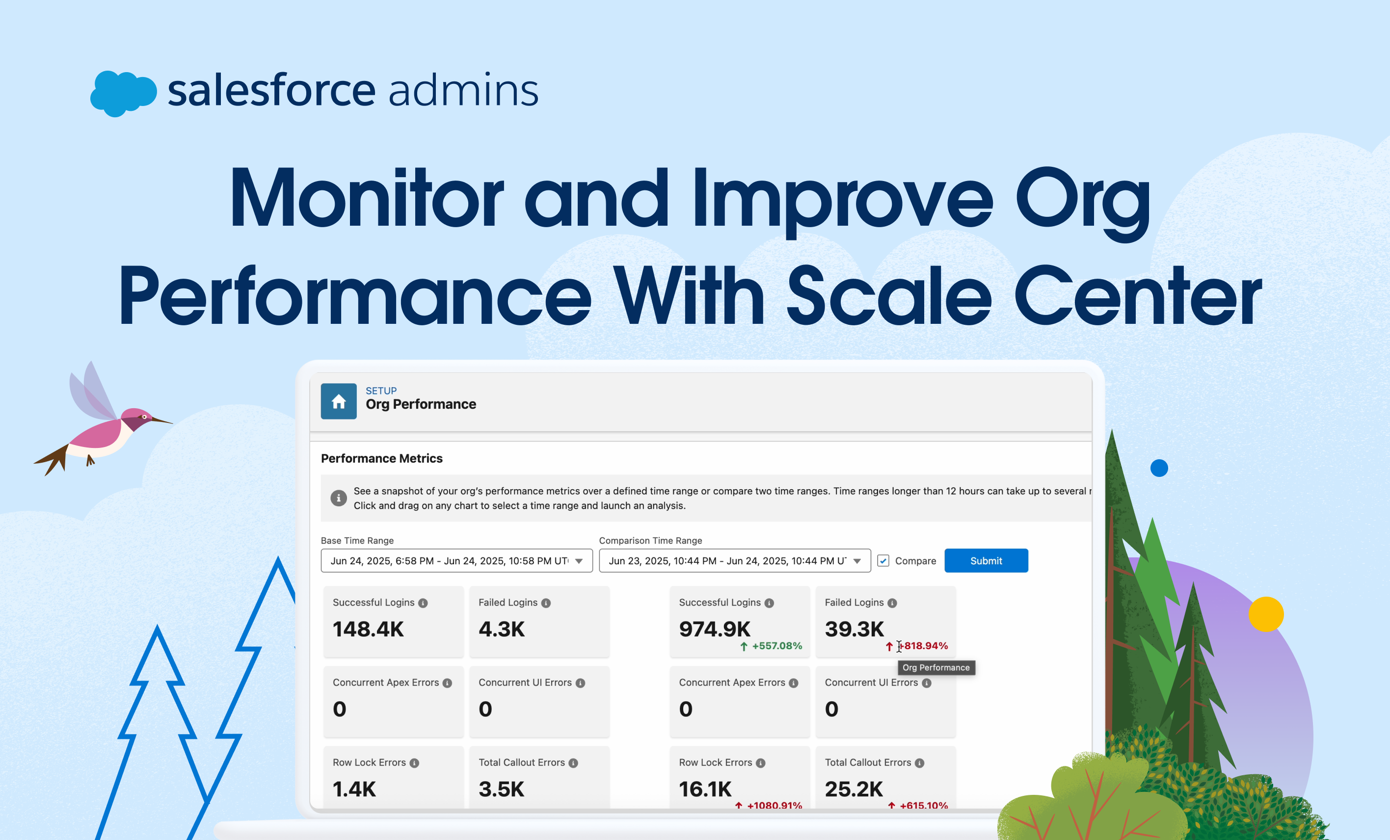
Computer monitor displaying a Sales Team Dream Dashboard.

Create a Dream Dashboard for Your Sales Team

By

Reports and dashboards are one of the go-to tools admins can use to make data actionable. I’ve heard countless stories from admins about how they built a dashboard, showed leadership, and got a “This is amazing!” response. Admins have shown me reports and dashboards to track all sorts of key performance indicators (KPIs) that have not only enabled their organizations to make smarter, better decisions, but have also established them as a trusted partner in helping their organizations succeed. Data analysis is a core Salesforce Admin skill and it’s part of our Salesforce Admin Skills Kit.

So, let’s dig into some reports and dashboard basics that will help you build your analytics mastery.

Report versus dashboard

You need to build a report before you build a dashboard. A dashboard is a collection of charts pulled from reports. You can filter and change the way the data is displayed in the dashboard, but the report is the base layer that organizes and sorts the data you want to display.

Does every report need a dashboard? Technically, no. But I would advise showing every report on a dashboard. Why? Because even though we love reports as admins, users might be overwhelmed by all the functionality in the report builder. Putting a report on a dashboard makes it easier to see the stories your report is telling.

Let’s walk through a few simple reports that will help you build a powerful sales dashboard—the “Sales Team Dream Dashboard.” This is an inspirational post, so if you want to learn in more detail, check out all the great reports and dashboards learning content on Trailhead (links in the Resources section of this post).

Sales Team Dream Dashboard

Before building anything, you need to have a goal. This is where we shine as #AwesomeAdmins because we know it’s important to ask a lot of questions to understand our stakeholders’ needs and then find ways to use Salesforce to help meet those needs.

Some questions you might ask before building a dashboard might be:

  • What are the organization’s KPIs?
  • How do you want to use the data?
  • Who should view this data?
  • Is the data clean and up to date?

Once you’ve got a clearer picture of the goal, then you can start building, which starts with reports.

After asking the sales team about their KPIs, we learn that right now they really care about getting a full picture of how many sales they’ve made and are expected to make, which accounts have the biggest sales opportunities, and identifying any gaps in regional sales coverage. They want to focus investment into the areas that aren’t generating a lot of sales and make sure they know how much money they are making and when.

That means we need to build some reports that track opportunities (sales) and display data about amount, close date, status, expected revenue, region, and lead source that is organized in a way that enables the sales team to get the insights they need to make decisions.

First, let’s build a report that displays opportunities that have closed (sold!) by amount and close date grouped by fiscal quarter.

Steps:

  • Select the Reports tab, then click the New Report button.
  • Select the Opportunities report type, then click the Start Report button.
  • Click the Filters tab in the report builder, and change these filters: Show Me – All Opportunities, Close Date – All Time, Opportunity Status – Closed Won.
  • Click the Outline tab in the report builder, and remove the unnecessary columns by clicking the “x” to the right of the column names you don’t need so that only Account Name, Opportunity Name, Amount, Close Date, and Fiscal Period display.
  • Click the drop-down arrow on the Fiscal Period column header, and select Group Rows by This Field.
  • Click the drop-down arrow on the Amount column header, and select Summarize – Sum.
  • Click the Add Chart button near the top of the page and select Bar, give it a title, and make sure the Show Values checkbox is checked.
  • Click the Save & Run button, name it Closed Won Opportunities by Quarter, and click Save.

Then, let’s build a report that displays opportunities that are open by stage and amount.

Steps:

  • Select the Reports tab, then click the New Report button.
  • Select the Opportunities report type, then click the Start Report button.
  • Click the Filters tab in the report builder, and change these filters: Show Me – All Opportunities, Close Date – All Time, Opportunity Status – Open.
  • Click the Outline tab in the report builder, and remove the unnecessary columns by clicking the “x” to the right of the column names you don’t need so that only Account Name, Opportunity Name, Stage, Fiscal Period, Amount, and Probability display.
  • Click the drop-down arrow on the Stage column header, and select Group Rows by This Field.
  • Click the drop-down arrow on the Amount column header, and select Summarize – Sum.
  • Click the Add Chart button near the top of the page and select Funnel, give it a title, and make sure the Show Values checkbox is checked.
  • Click the Save & Run button, name it Opportunities by Stage, and click Save.

These two reports tell us how much money the team’s sold and when, and how much they expect to sell and when.

Next, we need to build a report that helps us identify where to make investments in generating new sales. That means building a report that displays opportunities by region and another one by lead source.

Steps:

  • Select the Reports tab, then click the New Report button.
  • Select the Opportunities report type, then click the Start Report button.
  • Click the Filters tab in the report builder, and change these filters: Show Me – All Opportunities, Close Date – All Time, Opportunity Status – Open.
  • Click the Outline tab in the report builder, and remove the unnecessary columns by clicking the “x” to the right of the column names you don’t need so that only Account Name, Opportunity Name, Stage, Fiscal Period, Amount, and Billing State/Province display.
  • Click the drop-down arrow on the Billing State/Province column header, and select Bucket This Column.
    • Name the bucket Region.
    • Click the Add Bucket button and create buckets for each region: West Coast, Southwest, Midwest, East Coast.
    • Check the boxes for CA and OR state values, and then click Add to Bucket – West Coast. Do this for each region bucket.
    • Click the Apply button.
  • Click the drop-down arrow on the Region column header, and select Group Rows by This Field.
  • Click the drop-down arrow on the Amount column header, and select Summarize – Sum.
  • Click the Add Chart button near the top of the page and select Donut, give it a title, and make sure the Show Values checkbox is checked.
  • Click the Save & Run button, name it Opportunities by Region, and click Save.

Screenshot of the Edit Bucket Column modal while building the Opportunities by Region report

Now, let’s create a similar report to display opportunities by lead source.

Steps:

  • Select the Reports tab, then click the New Report button.
  • Select the Opportunities report type, then click the Start Report button.
  • Click the Filters tab in the report builder, and change these filters: Show Me – All Opportunities, Close Date – All Time, Opportunity Status – Open.
  • Click the Outline tab in the report builder, and remove the unnecessary columns by clicking the “x” to the right of the column names you don’t need so that only Account Name, Opportunity Name, Stage, Fiscal Period, Amount, and Lead Source display.
  • Click the drop-down arrow on the Lead Source column header, and select Group Rows by This Field.
  • Click the drop-down arrow on the Amount column header, and select Summarize – Sum.
  • Click the Add Chart button near the top of the page and select Column, give it a title, and make sure the Show Values checkbox is checked.
  • Click the Save & Run button, name it Opportunities by Lead Source, and click Save.

Screenshot of Opportunities by Lead Source report

We also want to let the sales team see which customers have the most sales opportunities so the team can focus their attention on those accounts. Let’s create a report that displays opportunities by expected revenue per account.

Steps:

  • Select the Reports tab, then click the New Report button.
  • Select the Opportunities report type, then click the Start Report button.
  • Click on Filters tab in the report builder, and change these filters: Show Me – All Opportunities, Close Date – All Time, Opportunity Status – Open.
  • Click the Outline tab in the report builder, and remove the unnecessary columns by clicking the “x” to the right of the column names you don’t need so that only Account Name, Opportunity Name, Stage, Fiscal Period, Amount, Expected Revenue, and Probability display.
  • Click the drop-down arrow on the Account Name column header, and select Group Rows by This Field.
  • Click the drop-down arrow on the Amount column header, and select Summarize – Sum.
  • Click the Add Chart button near the top of the page and select Donut, give it a title, and make sure the Show Values checkbox is checked.
  • Click the Save & Run button, name it Expected Revenue by Account, and click Save.

Screenshot of Expected Revenue by Account report

Now that we’ve got all these reports, let’s put them on a dashboard so our sales team can see the data in one place.

Steps:

  • Click the Dashboards tab, then the New Dashboard button atop the page.
  • Give your Dashboard a name and description, then click Create.
  • Click + Component, select the Closed Won Opportunities by Quarter, check the Use chart settings from report box, and then click Add.
  • Click + Component, select the Opportunities by Stage report, check the Use chart settings from report box, and then click Add.
  • Click + Component, select the Opportunities by Region report, check the Use chart settings from report box, and then click Add.
  • Click + Component, select the Opportunities by Lead Source report, check the Use chart settings from report box, and then click Add.
  • Click + Component, select the Closed Won Opportunities by Quarter report, select Display As Number(1 2 3 button), and then click Add.
  • Click + Component, select the Opportunities by Stage report, select Display As Number (1 2 3 button), and then click Add.
  • Click + Component, select the Expected Revenue by Account report, check the Use chart settings from report box, and then click Add.
  • Now you can move the components around and resize them to your liking, and give them names that will resonate with your sales team so they know what they’re looking at.
  • Click the Save button and name it Sales Team Dream Dashboard.

TA-DA! You’ve got a gorgeous Sales Team Dream Dashboard. Let’s summarize each component.

The first component on our dashboard is a chart that shows sales by quarter, which pulls from our opportunities by amount and close date report.

The next component is a chart that shows the potential sales by stage in the sales process, which pulls from our open opportunities by amount and probability report.

Then we have a component that shows the opportunities by region, which enables the sales team to know which regions need more support.

We’ve also got a component that shows opportunities by lead source, which helps the sales team understand where most of their sales are coming from.

And we have a component that displays expected revenue by account, which makes it clear which customers need the most attention.

Then, we’ve got a component that shows total sales completed and total potential sales in big, clear text so the sales team knows exactly where they’re at for the year.

Screenshot of Sales Team Dream Dashboard

This dashboard is truly dashing, but, our work isn’t done as an #AwesomeAdmin. Now we need to socialize this beautiful creation with our sales team, which means a few training sessions, maybe a “lunch and learn,” or recording a few quick videos to post on Slack to make sure everyone knows it exists and how to use it.

Now that you’ve got this simple example, I encourage you to build your own “Dream Dashboard” and experiment with different report types and chart elements—and have fun with it! If you build something you’re proud of, I’d love to see it! Share with us on Twitter or the Trailblazer Community.

Resources

Image of Stephen Brown next to text that says, "Skills for Success: Data Management."

Flex Your Data Management Skills as a Salesforce Admin

If you’ve tuned into any podcast or blog post on data recently, chances are you’ve heard data referred to in lofty terms. “The oil of the 21st century” and “the lifeblood of any business” are some that come to mind for me. What is definitely true, in the context of your Salesforce environment, is that […]

READ MORE
Image of David Carnes next to text that says, "Skills for Success: Data Analysis."

Build Your Data Analysis Skills as a Salesforce Admin

Twenty years ago, while managing systems for the IT team at a small software company, I was encouraged by our CEO to think of myself as a business person first and an IT person second. He knew of my love for working with systems and data, and suggested that employing those talents to optimize processes […]

READ MORE