Summer ’24 is almost here! Learn more about new Flow Builder enhancements like the Automation App, Action Button (beta), and more, and check out Be Release Ready to discover more resources to help you prepare for Summer ’24.
Want to see these enhancements in action? Salesforce product manager Sam Reynard and I demoed some of these features on a recent episode of “Automate This!” Watch below.
Screen flows
Summer ’24 marks yet another huge leap forward in screen flow capabilities with the Repeater component going generally available (GA) and our newest component, the Action Button, enabling truly reactive, dynamic screens.
Create multiple records on your screens with Repeaters (GA)
One of the most eagerly awaited screen flow features is now GA!
With Repeaters, you can easily create multiple records on a single screen. For example, use a Repeater component to collect information about beneficiaries on an insurance policy. When a user runs the flow and reaches the screen, the user can add as many beneficiaries as needed.
You can then loop through and save the list of beneficiaries to use later in the flow.
NEW: The Repeater component now supports most standard GA screen components as child components. Additionally, Repeaters now support conditional field visibility, input validation, and help text. When you debug a flow that includes a Repeater component, the debugger now displays information about the component.
Here are some considerations when using a Repeater component.
Formulas: You can’t create formulas within a Repeater that reference other components within that same repeater instance. Only formulas that reference components outside of the Repeater will work.
Action Buttons: Action Buttons are currently not supported within a Repeater. Read on to learn more about Action Buttons.
Reactive Collection Choice Sets: Collection Choice Sets within a Repeater are not yet reactive.
Sections and Columns: You can’t embed a Repeater within a section or add columns.
Amplify your reactive screens with Action Buttons (beta)
Add an Action Button component to a screen to run an autolaunched flow that can retrieve or crunch data, then makes the data available in your screen for other components to use. This unlocks the true power of reactivity to let you create truly dynamic single-page applications.
Here are a few use cases you’ll now be able to achieve all within a single screen.
Generate a data table or set of radio options of related records when a set of parent records, like accounts or contacts, is selected from any component.
Retrieve product data from an external system and bring the results back into the screen for a user to select.
Create dynamically dependent picklist fields based on record data, like car makes to car models, or school majors and concentration selections.
Summarize the record selections made from a data table like a minimum date, total amount, or related record details.
As seen in the animation below, one of the golden use cases for reactivity is keeping users on the same screen when you select an account and need to show related records for that account—whether it be cases, contacts, or opportunities. With Flow-powered Action Buttons, you can now do that quickly and easily.
To configure an Action Button component, drag the Action Button component into your screen editor, give your button a label, select an active autolaunched flow, then configure the inputs into the autolaunched flow—just like you would for a subflow.
After setting up your Action Button’s inputs, you can then access that action’s results anywhere on the screen to create richer, more dynamic screens (as shown in the animation above). In the below example, you can configure a Data Table component to use the action’s case collection to dynamically generate case data when the action executes.
We are so excited to get this into your hands to play with. Let us know if you have feedback on the Trailblazer Community: Action Button Beta.
Stay tuned for a spotlight post here on the Admins blog for more tips, tricks, and recommendations on this new capability.
Set conditional Disabled and Read Only states for more components
I am very pleased to share that you can conditionally set several components to Read Only or Disabled state. What does this mean? Well, for starters, you won’t have to fiddle with the Display Text component when you want to show data on the screen that you don’t want a user to interact with, such as confirmation screens or calculations.
With conditionally disabled states, you can protect users from making mistakes by disabling fields, letting you enforce business logic on the form. For example, in the below scenario, you might not want users updating the case owner or priority if there’s a critical case created.
While it may not be immediately obvious, this also means you won’t need to exclusively rely on conditional visibility to protect your inputs from bad data. You can now just disable the inputs you don’t want touched until the criteria is met, which is a great option for accessibility-minded implementations.
Read Only and Disabled states have been added to the following standard components.
Text
Long Text Area
Date
Date Time
Number
Currency
Password
Address
Additionally, the following Choice components can now be statically or conditionally disabled.
Choice Lookup
Radio
Checkbox Group
Picklist
Multi-select Picklist
Utilize new Address component improvements
Major improvements are coming to screen flow’s Address component! Based on feedback from True to the Core and the IdeaExchange, we’re making several improvements to the Address component.
A Google Address Lookup that allows your users to search for a location and fill in every address field instantly
A new reactivity-enabled Required option to require all address fields
A new reactivity-enabled Disabled option to disable all address fields (like in a confirmation screen)
We’re providing proper support for State and Country picklists by adding CountryCode and StateCode inputs/outputs. This will prevent any DML-related issues when trying to update a country with the country’s name instead of their country code, as raised in True to the Core.
Note: If you have State and Country picklists enabled, you should create and update records using the CountryCode and StateCode values, not the country value and state value outputs, to prevent any DML-related issues.
Screen flow reactivity improvements
For more information on reactivity, check out our Trailmix, curated by the Flow team.
Collection Choice Sets are now reactive
In Summer ’24, when the underlying source collection for a Collection Choice Set changes, new options will be generated. This feature makes for an excellent pairing with the new Action Button component, as you’ll finally be able to generate a set of dependent choices on the same screen, like contacts for an account selected or a set of cases for a selected set of contacts.
Reactive Display Text better supports same-screen record references
When you reference the selected row of a Data Table in a Display Text component on the same screen, such as the opportunity amount, a date field, or other field type that requires special formatting, we now format the field for you! Previously, as a workaround, you had to wrap the reference in a formula of the right data type to get the special formatting.
Reactivity now runs when the screen loads for more inputs
When we rolled out reactivity, only certain inputs into a component would run reactively when the screen loaded. This meant that if you have a case subject that uses a priority field to generate the subject name, and if that priority field had a value when the screen loaded, we ensured that reactivity would run without any user changes on the screen.
We’ve made it so that components that have ‘Input Only’ attributes, like Data Table’s Source Collection input and the Text input’s new Disabled/Read Only inputs, now run reactivity when the screen loads. This ensures that if you have a Lightning web component that executes when the screen loads (like Data Fetcher from the AppExchange) and feeds data into an input like the Data Table component, the data will be present when the screen first loads. Another benefit to this improvement is that if a Data Table uses a collection generated on the same screen, it will now remember the selection if you encounter an input validation error on the screen.
Note: This feature works in API version 61.0 and later.
Subflows in screen flows now run the active version, not the latest version
If your screen flow is running API version 61.0 and later, any subflow now runs the active version instead of the latest version of the flow.
Screen flows have more detailed error messages
You can now provide Salesforce Support with more detailed error messages or debug on your own in screen flows that encounter special errors. In some error scenarios, we would provide a generic error message on a flow screen, like “Hmm, that didn’t work. Check your internet connection and try again, or refresh the page.”
For those error scenarios, we now provide more detail that you can use to send to Salesforce Support or diagnose on your own. For example, if your custom Lightning web component tries to navigate to the next screen but you didn’t enable navigation, we would now surface the underlying error: “Action not available for interview: NEXT.”
Flow management
Easily manage flows with the Automation App
A new way to manage and work with your flows arrives! You can now manage flows through a full-fledged Lightning app where you’ll be able to filter, search, and create list views for your flows.
This is a huge advancement and a testament to Salesforce’s continued investment in Flow. Stay tuned for Flow Release Readiness Live where we’ll go into this feature in more detail. In the meantime, get excited!
Flow Builder enhancements
Manipulate data easier and faster with the Transform element (GA)
Seamlessly map, transform, and optimize data from one data source to another source with the Transform element, now GA.
With the Transform element, you can take complex, nested data structures that come from Apex-defined types and HTTP callouts and convert them to record collections or other Apex-defined types.
You can also use Transform to replace Loops in Flows that need to use logic to set values in a collection or converting a record collection from one object type to another. A single Transform element can accomplish what would otherwise require a Loop and careful Assignment of collections and their items. And here’s the kicker: When the flow runs, it’ll run much faster using Transform rather than Loops!
We’ve added some under-the-hood improvements, guided mapping tips and guardrails, and accessibility support, including keyboard shortcuts and screen reader support.
Specify matching criteria to update existing records
When creating a single record in the Create Records element, you can now specify matching criteria to update an existing record instead of creating a new one. You can also specify what should happen if multiple records match the criteria.
One interesting thing to note here is that you can match on more than just an External ID, unlike the traditional Upsert operation. This is a huge data quality improvement!
The team is actively thinking about how we bring this to more than just single-record creation scenarios—stay tuned.
View the required fields on an object when creating a record
Now when you create a record using the Create element, an object’s required fields will automatically appear when setting the field’s values. This will prevent any surprises down the line when you end up testing your flow.
Use the Is Blank and Is Empty operators to check for ‘nothing’
A huge quality of life improvement is now available. Using the new Is Blank operator, you can now check for both Empty String and Null values with a single operator. On top of that, we added a new Is Empty operator that checks for both Null and Empty collections. You can eliminate the workaround of assigning collection counts to number variables and performing logic on that count (like with Collection Filter) to determine if there are no records in a collection.
You can find the Is Empty and Is Blank operators in the Decision, Wait, and Collection Filter elements.
When available, we recommend you use the Is Empty and Is Blank operators moving forward instead of the Is Null operator.
Considerations
Note: If you have a collection of multiple null records, that will not be considered empty. This might look something like {[null],[null],[null]} in Flow’s debugger. Our goal was to match the same empty-checking behavior as Apex. Ensure you aren’t adding null/empty records when creating your collections via Loops or Invocable Actions!
Enjoy improved builder performance for orgs with many custom labels and custom settings
In some cases, Flow performance suffered when an org had thousands of custom labels and custom settings. We’ve drastically improved performance for loading global variables into Flow. In some cases, performance went from 2.3 minutes to load a flow last release to 1.8 seconds this release. Wow!
Actions
Default values and placeholder text for Invocable Actions
Developers creating invocable Apex actions can now provide more setup guardrails by providing default values and placeholder text for their Invocable Action inputs. This will add considerable ease of use improvements for anyone using Apex in their flows, as it takes the guesswork out of setting up an Invocable Action.
Lock/Unlock Record action now available
Users can now take advantage of the new Lock/Unlock action to lock records from being edited except those in the ‘Allowed ID’ list of users. The Allowed ID input can be a User, Group, or Queue of users.
Ease of use improvements
Actions and Subflow modal moved to a side panel with UX improvements
Actions and Subflow configuration has moved to the side panel—and with it, a number of great UX improvements.
With Actions, we now show the unique name as a card in the action configuration panel. This means you can now see the full Apex class name instead of only seeing the label. This will let you easily find the Apex class you need in order to make any changes to it.
Friendly Resource picker now in more locations
Flow’s new Resource picker allows for a smoother selection and identification of Flow resources, elements, and values. It features a label-first naming system, an informative tooltip, more intuitive icons, and clickable breadcrumbs for easy navigation.
This improved experience is being rolled out in phases and has now been extended to the expression builder pickers within the Decision element. It’s also accessible in a range of elements for pickers without expressions, including Action, Collection Sort, Collection Filter, Loop, Subflow, Orchestrator stage, Orchestrator Step, and Recommendation Assignment.
Toolbox elements now display Labels instead of API Names
The toolbox has been updated to display Labels instead of API Names for elements, enhancing user-friendliness. Additionally, it now includes a hoverable tooltip that provides useful information, including the API Name.
Streamlined element panel headers
We’ve simplified the header for a more consistent experience when adding and editing elements. Now, when you add an element, the system automatically generates the element’s Label and API Name, with the Label selected for effortless editing. When you open an existing element, the element’s Label, API Name, and Description are prominently displayed, eliminating the need to click ‘Edit’ within the header.
Schedule-triggered flows
Debug scheduled flows with specific records
When you’ve configured a scheduled flow to run as a batch (in the Start criteria), you can now select a specific record to debug instead of having the Flow debugger decide. You can also choose to apply or skip the entry conditions.
Lastly, when the debug completes, you’ll be able to see how many records will run for the batch when the scheduled flow runs.
Flow Orchestration
Pause, resume, and recover failed orchestration runs
Orchestration users are automating long running processes, but sometimes things go wrong along the process and you need to update the execution logic. Now, you can pause and resume an orchestration run. If an error happens, you can fix it and resume from where the run failed. On the Orchestration Runs list, customers can select a new set of actions available based on the current run status.
Create orchestration run dashboards
Orchestration managers want to report on Flow Orchestration objects to better understand their orchestration consumption and drive continuous improvements. You can now use enhanced standard reports and new dashboards to visualize these long running processes.
View a list of assigned work items on the work guide
Each interactive step in an orchestration generates a work item assigned to a user on a specific record. At times, users will be assigned multiple work items across orchestration runs on the same record. The work guide will now show a list of work items if a user is assigned multiple items for a record.
Summer ’24 resources
The Flow team can’t wait for you to take all of these new features for a spin. With each release, Flow becomes more powerful, helping admins and developers quickly deliver amazing, new experiences for their users.
Throughout Summer ’24, we’ll publish blogs and videos to help you prepare to get the most out of this release! Bookmark Be Release Ready and check back regularly as we continue to add new Summer ’24 resources for Salesforce Admins.
Wow! Dreamforce 2025 was one for the books. From connecting and learning together to building the Agentic Enterprise, the event was packed with inspiration and innovation — including some game-changing announcements in the Admin Keynote. This year’s keynote took us to Coral Cloud Resorts, a fictional luxury resort featured in Trailhead challenges and Agentforce NOW workshops […]
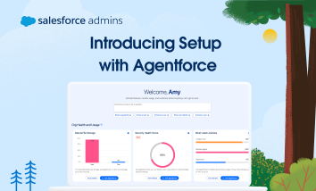
Editor’s note: This post was updated on May 26, 2026, with the latest resources and information. Setup with Agentforce is generally available (GA). Read the full announcement here. Hello, Awesome Admins! I’m excited to tell you about how we’re improving Setup with the power of Agentforce. Setup with Agentforce is now GA. You are still […]
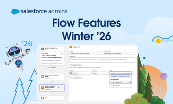
Winter ’26 is almost here! Learn more about Flow features and check out Be Release Ready to discover more resources to help you prepare for Winter ’26. The improvements to Flow are coming—and fast. To help you keep track, let’s break down the new features into some key categories. General Flow Builder enhancements Flow management […]


