Tune into the Lightning Experience Pro Tips blog series to learn about setting up Lightning Experience and how to avoid common gotchas along the way.
We know change management can be a full-time job for #AwesomeAdmin Trailblazers, and driving user adoption in Lightning Experience is no exception!
We’ve been listening to you and your end users and we’ve created some powerful tools for app building and customization in Lightning Experience. Through recent user experience research, we’ve gained excellent insights from users about where our product needs to go (See: Display Density Settings). We’ve also learned about how challenging it can be for Admins to identify which customizations might best drive end-user adoption and engagement.
Between our product vision and #AwesomeAdmin innovation and feedback, we’ve identified some simple ways to configure Lightning Pages for a great user experience. To close out the Pro Tips series, let’s look at how you can use these options to help your users work more efficiently in Lightning Experience. What Admin wouldn’t love that?
Since many ‘End-User’ personas spend much of their day using Record Detail data, we’ve focused this post on five customizations that make accessing this data as efficient as possible, without extra scrolling or clicks:
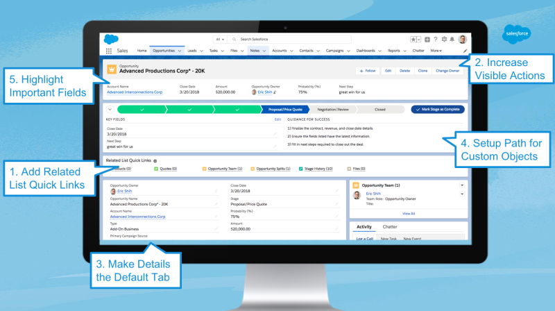
Help your users find information they need faster by configuring Related List Quick Links and/or Related List – Singles
The card-based Related List components that display on out-of-the-box record pages in Lightning sometimes take up a lot of space and require users to scroll to reach the Related List they need.
Enter the Related List Quick Links (RLQL) component, which will drastically reduce your users’ time to task! It is the new and improved version of the Classic Related List Links, and similarly displays all your related lists as hoverable links in a single component.
Users are able to hover and view up to 10 records and all related list columns, perform mass actions, and sort without ever leaving the page. Users are also able to customize the order and even remove related lists to fit their needs (user settings are specific to a user, and will not affect other users). The component is also responsive so if your browser size is large, you will see more columns of links.
TIP: Use ‘Esc’ to quickly close a related list hover.
To configure Related List Quick Links (RLQL):
- Go to the Lightning App Builder. From a record detail page, click the gear icon in the top right and then click ‘Edit Page’.
- Remove the Related Lists component that is on the page by default by selecting it and pressing the delete icon in the top right.
- Search for Related List in the search find box to quickly find all the available Related List components.
- Drag a Related List Quick Links component onto your page. The most popular locations are in the narrow side region or full width right under the highlights panel.
- Press ‘Save’ and go through the activation process if this is your first time editing a Lightning Page, and go back to the record you were looking at to see the fruits of your labor.
- Note: currently, a Related List still must be on a user’s assigned page layout for it to appear for that user. We are working on moving visible related lists in Lightning Experience away from page layouts to be tied to Lightning Pages. Stay tuned for more updates in the future.
We understand there are times when you want certain related information to be visible directly on the page. For these situations, the Related List – Single component is the way to go. Go back to the Lightning App Builder and drag one or more Related List – Single components onto your page and select the appropriate related list.
TIP: You can also show related data from related objects by changing the Parent Record attribute to the desired lookup field.
Congratulations! You have successfully configured RLQL. These components will provide a huge boost to productivity for your users and also clean up a lot of vertical real estate on your pages.
Reduce clicks by increasing the number of visible action buttons in the Highlights Panel
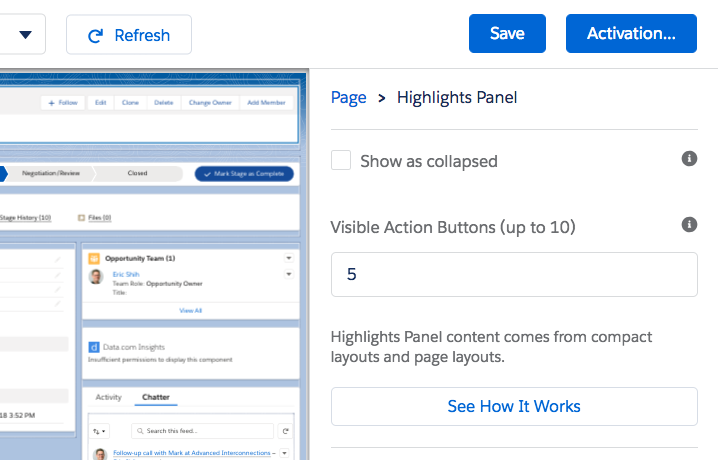
By default, the Highlights Panel will show the Follow / Following button, along with the first 3 action buttons from a user’s assigned page layout. Any additional action buttons will be accessible via a dropdown.
To customize the number of Action Buttons that are visible:
- Go to the Lightning App Builder
- Select the Highlights Panel component
- Update the Visible Action Buttons attribute value. The number of visible action buttons can be set to a value from 0 (everything is in a dropdown) to 10. The Follow / Following button is separate and does not count towards this limit. If you always want to see as many actions as possible, set this property to 10. Don’t worry, if there is not enough space to fit 10 actions for whatever reason (long labels, small browser size, etc.) the component is intelligent and will automatically overflow actions into the dropdown.
It is worth keeping in mind that we do prioritize respecting your metadata, so the component will show as many actions as possible, which means potentially showing less of the record name when there are many visible actions configured. Make sure to test out your changes to ensure the record name and actions appear as you expect.
After increasing the value, more buttons will be visible, saving the extra click to open the dropdown. Talk about productivity!
Set the Record Home tab default based on your users’ needs
Consider making Record Details the default (either as a tab or standalone).
In our research we observed many users getting tripped up on record home pages that defaulted to Related instead of Details, as well as by inconsistency of these defaults across objects. Please note: this highly depends on your users’ workflow! We recommend observing your users “in the wild.” If the first thing they do on a Record Page is click over to Details, you can save them a click by changing this default.
For most of our standard objects, out-of-the-box record details is behind a secondary DETAILS tab for most of our standard objects.This means it is one click away for users. For Custom Objects, DETAILS is the default tab out of the box. We are revisiting our out-of-the-box configurations along with other research topics to improve the default experience, however, for the time being this is a customization that you will need to make.
To do this there are two options:
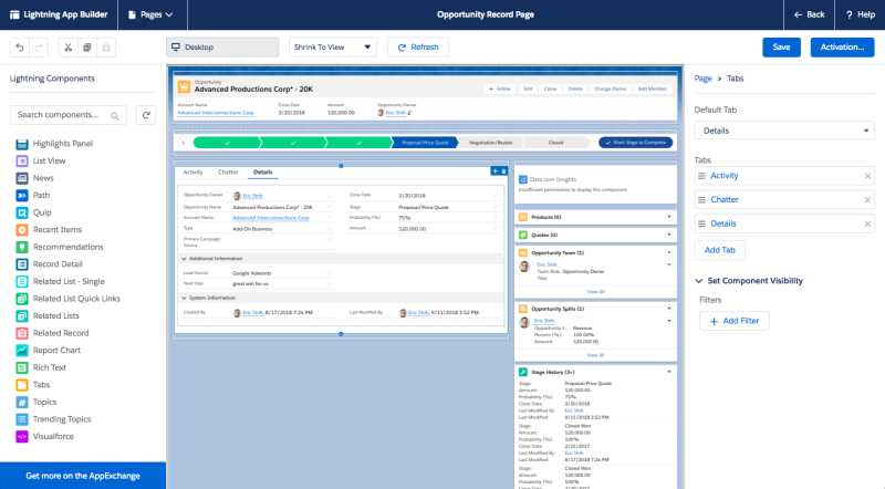
Keep the tabs and make the appropriate tab default. This can be done by clicking the on the Tabs in the Lightning App Builder and updating the ‘Default Tab’ attribute in the right-hand pane. You can make any tab the default via the Default Tab attribute, no matter it’s position.
If you want to further customize, you can also move components outside of the tabs and move tabs to different regions, similar to what is shown at the start of the article where Details is outside of a tab and Activity and Chatter are now in tabs in the narrow region.
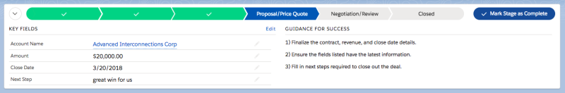
Set up Path for your Custom Object, and use it to represent linear processes
>Out of the box, Opportunities and Leads have a Path component that helps visualize the current status of a specific record and enables users to quickly update data and status. You can update the path settings with additional information or create your own Path for supported Standard Objects and all Custom Objects. Please note that we have observed some users becoming confused by Path when it has been used to represent non-linear processes. In those cases, proceed with caution and test your Path with users to ensure they aren’t tripped up.
To update Path settings or create your own path check out this help doc or follow these steps:
- Go to Path Settings in Setup and select ‘New Path’.
- Follow the steps to create your new path, making sure to select the appropriate picklist for the path, as well as adding the right fields and guidance for each picklist value.
- Once your Path is set up and activated, ensure it is on the page in the Lightning App Builder.
- Configure the attributes for the path in the right-hand panel as appropriate for your process.
- Save, activate, and assign as appropriate, then visit a record to see your new Path.
Your users can now easily visualize the status of your Custom Object Records and quickly update information right from your custom path!
Note: By default the Path stages display as collapsed, even if you have added fields and guidance to a stage. You can update this in Path Settings in Setup to remember your users’ preferences.
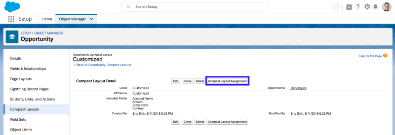
Place the most important fields in the Highlights Panel based on your users’ needs
For example, many Sales Personas often need phone numbers to jump out at them. The highlights panel at the top of Record pages is a great place to put key information. It is based on the fields in the Compact Layout. Compact Layout has some key fields for standard objects out of the box, but for custom objects it will only have the name field.
In order to make the Highlights Panel display the right info for your users, take these steps:
- Go into the appropriate Object in Object Manager, and click the Compact Layouts navigation item.
- From this page, press the ‘New’ button in the top right to go to the new compact layout screen, add the desired fields, and press Save.
- After this, press the Compact Layout Assignment button to edit the assignment to your new customized compact layout to ensure your users see it.
And that’s it! You have now customized the fields that are shown in the Highlights Panel!
Hopefully this set of customizations and User Experience tips has been helpful and you’re feeling encouraged you to dive deeper into the world of customization in Lightning Experience. What was your favorite customization from above? Are there any customizations you have personally implemented that made a difference to your users you would love to share? Let us know below!
Bonus: Accessibility Tip! For screenreader users, consider assigning custom page layouts that avoid placing components inside of Tabs or Accordions. For example, instead of placing Feed and Record Details components inside of Tabs, place them directly on the page, one on top of the other. This will make navigating Lightning much easier and more efficient for screen reader users. Stay tuned for more in-depth guidance on best practices for making Lightning Pages accessible!
Coming to Dreamforce? Join us for a live demonstration of these tips and others. We’ll also share insights on Lightning Pages from our user research, and guidance on how to do your own user research! Add to your Agenda Builder now.
Additional Resources:
Path Overview and Help:
Optimize Sales Processes Using Path
Know your Users:
User Research Basics Trail
Check out the other posts in the Lightning Experience Pro Tips blog series for more help with your Lightning Experience rollout.
About the Authors:

Emily Witt is a former Not-for-Profit Admin turned User Experience Researcher at Salesforce who is passionate about making the tools that Salesforce provides as easy to use as they are powerful.

Eric Shih is a Product Manager at Salesforce. He enjoys working with design, research, engineering, and most of all, customers to create and build amazing experiences for Salesforce users. Eric is active on the Trailblazer Community and would love to hear your feedback!

