How I Solved This: Compact Custom Related List Details

By

Welcome to another post in the “How I Solved This” series. In this series, we do a deep dive into a specific business problem and share how one #AwesomeAdmin chose to solve it. Once you learn how they solved their specific problem, you’ll be inspired to try their solution yourself! Let’s take a look at how Michael Kolodner was able to summarize list view information in a more concise and consumable manner.

Background

Depending on the width of the page you’re displaying a related list on, you may only have room for a handful of fields. Even with a full-width list, it’s hard for users to scan all the way across. Now, add different record types using different sets of fields for their most important data and it can be really challenging to decide which fields to display in your table!

Key business problem

For example, below is a related list of the Grades custom object in an education org. Grades use two very different record types: Course Grade and Attendance. A course grade, not surprisingly, represents the mark a student gets in a particular class in a particular semester. Meanwhile, an Attendance record counts absences for the semester.

A Grades related list with five columns, about half of which are blank for each row because they are different record types.

Notice that, in the screenshot, each row has about half of the columns empty. That’s not a bug, they’re just not the fields that are used for that record type. It feels like a waste of screen real estate and a missed opportunity to make the related list easy for users to parse for information, right?

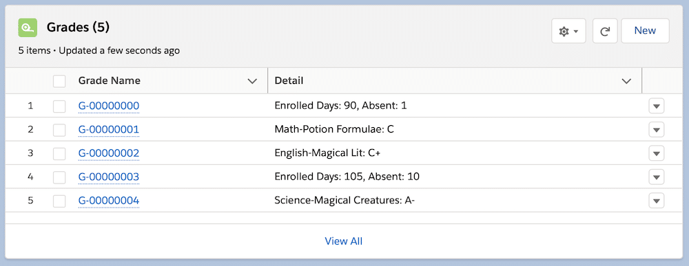
My upgraded (pardon the pun!) list view is below. And this time I’ve taken a screenshot of it on only two-thirds of the page, the default Lightning Page layout. It’s now got even more information for each row than the original list view could display when I took a screenshot of the full-width view!

A Grades related list with just two columns but even more information than the original table displayed.

Below, I’ve placed an even more generic example. I added just one field, Type, to the default Opportunities list view on an Account page as displayed in a moderate-width browser window. With an opportunity naming convention that includes the Account name, the Opportunity Name field is truncated. And the Type field, whose default picklist options are far longer than the 18 characters that can show here, is truncated nearly to the point of uselessness.

An Opportunities list view with five columns, two of which, Opportunity Name and Type, are not wide enough for the values to fully display.

A few moments’ work and this version of the related list has all the details my users might need:

Opportunities list view with the same fields, but now Type is abbreviated and no fields are truncated.

How I solved it

I solved this with a formula field that returns text. Seriously, that’s it.

Plenty of others must have done this before me, but it’s not a trick I’ve ever heard mentioned. It’s so obvious now that I’ve hit upon it that I’m almost ashamed to write a whole blog post about it. 

Honestly, the hardest part was deciding what to name my new formula field, since it’s going to be the column header in my related list. Even the formula writing is pretty simple if you’ve worked with formulas in Salesforce.

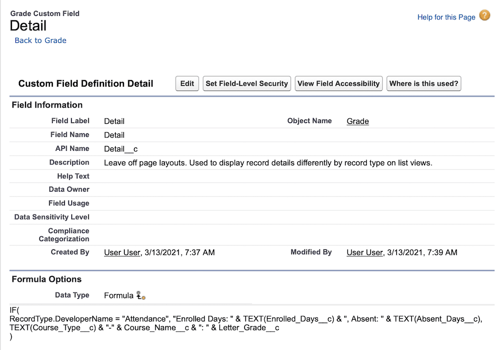
Let’s look at the Details field for the Grades related list. There’s not that much to see:

Field definition page for Detail__c, a formula field.

Here’s the complete formula:

IF( 

   RecordType.DeveloperName = "Attendance", "Enrolled Days: " &  TEXT(Enrolled_Days__c) & ", Absent: " &  TEXT(Absent_Days__c),


     TEXT(Course_Type__c) & "-" & Course_Name__c & ": " &  Letter_Grade__c

)

It’s a simple IF statement that returns one set of concatenated text and fields for the Attendance record type, and a different set otherwise. I had to convert number fields to text using the TEXT function. The spaces and punctuation are concatenated in using & (for concatenation) and enclosed in quotation marks. 

The formula for my Opportunities list view looks a little more complicated, but it breaks down pretty simply:

"$" & TEXT(Amount)


& " " &


Case(Type, 

"Existing Customer - Upgrade", "Exist-Up",

"Existing Customer - Replacement", "Exist-Repl",

"Existing Customer - Downgrade", "Exist-Down",

"New Customer", "New",

"")


& " " & TEXT(MONTH(CloseDate)) & "/" & TEXT(DAY(CloseDate)) & "/" & TEXT(YEAR(CloseDate))

This one starts with punctuation because once Amount is converted into text you lose the currency sign. Then, I’ve used the CASE function to translate the Type field’s rather long picklist values into abbreviations. Finally, if you just convert a date field using TEXT, you end up with YYYY-MM-DD, which I find a pain to read. So I converted the month, then day, then year, each with the slash between them as text.

Business results

The result speaks for itself! Instead of related lists with compromises for which fields to display, we’ve got related lists that show exactly the information users need and that fit within the width of the page layout.

Do try this at home

First, let me remind you that you don’t need to do this every time. Usually, it just isn’t necessary to write out a formula when you can just display the fields on the related list. And don’t forget that your users lose the ability to sort by a column if that column isn’t independent. But in cases like my Grades example, where the list is compromised by the number of blank fields, it’s a marked improvement to add a formula field like this and it only takes a couple of minutes!

So watch out for those times when you can’t decide which columns go in the related list layout because you’re having to compromise. That’s the moment to think, “Perhaps I need a formula here instead!”

And don’t forget that you can use a mix of the original field columns with formula columns to get the best of both worlds. That’s why my Opportunities list view still has Stage as a column, even though I could easily have included it in my formula.

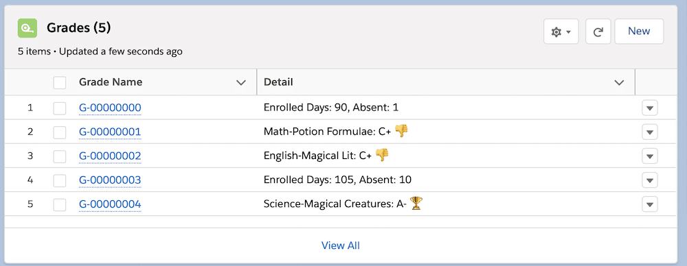
And one last idea: You could very easily include emoji in your formula, which would give quick graphical information in your related list, like this:

Grades related list again, this time with emoji representing the course letter grades.

Resources

Jen Cole pointing to herself and text to the left of her that says, "Manage Data with MuleSoft."

How I Solved It: Manage Data with MuleSoft

In this episode of “How I Solved It” on Salesforce+, #AwesomeAdmin Jen Cole solves an inefficient fulfillment and sales process using MuleSoft Composer. Learn how she approached building her solution and her tips for developing admin skills. The problem Once upon a time, not so long ago, I was asked to fix an inefficient sales […]

READ MORE
Paolo Sambrano next to text that says "Design User Friendly Apps."

How I Solved It: Design User-Friendly Apps

In this episode of “How I Solved It” on Salesforce+, #AwesomeAdmin Paolo Sambrano solves an inefficient service desk experience using App Builder and Flow. Learn how he approached building his solution and his tips for developing admin skills. The problem A long, long time ago, someone (ahem, maybe a less-experienced me) built a service desk […]

READ MORE